While I’m still working on the greater releases of the Hikari font family and Theory Serif, Sans and Mono, I was crazy enough to begin work on a fifth font project.
The idea was born out of a personal need. For months I have been working in Coda to write CSS and HTML code, and I got tired of the array of fonts in the monospaced category, some of which come with the system, some I collected over the past couple of years. From Menlo (Apple) to Droid Sans (Google), I couldn’t find a font that I found was well designed for an on-screen reading experience. Designers of monospaced fonts often claim they were thinking about computer displays first, but when you look at the results, especially in common sizes ranging from 10 to 18 points, the letter shapes often look washed up and have sometimes been just compressed or extended to fit a space (I’m looking at you, first version of Source Code Pro). Bad hinting and unclear shapes result in a nearly unidentifyable letter shape and the overall legibility is suffering.
Of course, the very idea of a monospaced font is actually against improved legibility, because it takes away nearly all options to even out white space and create a harmonic experience.
What can be changed though is the individual shape. I think nowhere else it is more crucial to get this part right, than with a monospaced typeface designed for screen. We have various screen resolutions today, ranging from tiny devices (like wrist watches) to an iMac with a 5k Retina Display. For programmers looking at a display for hours, the reading experience becomes as much, if not more, relevant than other practical considerations when choosing a monospaced font.
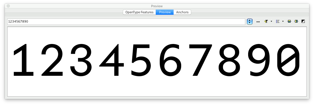
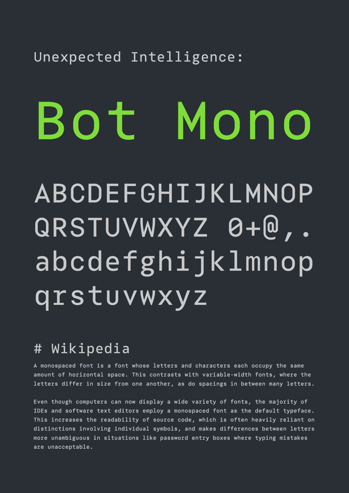
So this is Bot Mono, a very young, fresh project of mine and I hope you will share your thoughts and critique with me. There will be a few more changes and a large set of glyphs need yet to be worked out, the numbers are missing yet, but it’s already showing a lot of its personality and I am curious to hear what you think.
(Attached is a PDF for closer inspection)
Questions
- Do you think I’m on a good path overall? Do you see major mistakes or things you’d change, and why?
- You may have noticed the inconsistency of what Erik Spiekerman calls “the canon”, the pattern of shapes used for letters such as c, e, b and a. Some are closing, some have an open, humanist shape. The idea was partly inspired by Roboto and Nick Shinn’s recent release, Neology, which I love, by the way. What are your thoughts on this part? Do you think it works and doesn't disturb the reading flow?
| Attachment | Size |
|---|---|
| Bot-Mono-Sheet.pdf | 37.54 KB |