Typophile

Match for typewriter-type for graphic novel?

scillas

Hi!
I’m new here (though I’ve nosed around earlier).
I’m working on a graphic novel, or actually it’s more like a ‘graphic bio’ – a biography in the form of a picture book.

In the book, there are 3-4 different kinds/lines of text – the narrator’s voice, my main character’s voice – and then excerpts from letters, song texts and poems, written for and by my main character.
The 3 different kinds of text change a lot throughout the book, so that I sometimes will have all three kinds on one page or spread. Every page is illustrated and sometimes text is set on top of a drawing.

The two first kinds of text, the narrator and my main character, I think would work with quite many different typefaces,
My story takes place mostly in the 1960-1980s, when my character was young – in a beatnik-/alternative surrounding. I’d like the typeface for her and the narrator’s voice to have some warmth, but without attracting too much attention to itself. Maybe slightly handwritten and/or casual.
For now, I am leaning towards Cronos, and earlier I’ve looked at Joanna, Perpetua or Legacy Sans.

But, but, but: the letter/poem-texts are causing me a head ache! The only thing that I think really works for them, is using a “oldschool-typewriter”-face (like “Pitch”.) One with a vintage-typewriter-feel.
But I don't think the typewriter-face doesn't mix very well with any of the above mentioned. The shapes, perhaps, but also when combined with a typewriter face, they look a little (too) formal.
I looked at Nexus and Eureka, which both have a monotype-version, that I thought of using in stead of vintage- typewriter-type, but I think those monotypes look too contemporary for my book. Sigh.

Does this make sense? Do you have any ideas or suggestions?

I know this is the kind of thing you should discuss with a colleague, while having a coffee – but I don’t have that person right now. So – if anyone has thoughts, opinions or suggestions on this, it will be very much appreciated! Thanks so much!

Related perhaps, earlier typewriter discussion:
http://typophile.com/node/121353

> My story takes place mostly in the 1960-1980s,
> ...in a beatnik-/alternative surrounding

Would a beatnik be using a typewriter? I was a young person back then and most young folks didn't use them except maybe in upper-class schools, for college term papers, and office work. And it's harder to imagine a beatnik or hippie using one. You might need to include an explanation of why they are using it.

It depends on how much “graphic” and how much “novel” the result: if the typewritten text is visually framed, it shouldn’t clash with the rest.
If that is the case, I would go for an accurate rendition either historically (which model of typewriter?) and/or visually (a “worn out” face, like http://www.fontfont.com/fonts/trixie).
If the lines (pun intended) between the different kind of text are more blurred, you could use either a classic text face with a monospaced cut (like Century) or a proportionally spaced typewriter face (like the ones suggested in the aforelinked thread or http://www.fontsquirrel.com/fonts/lekton).
About the text faces you mention, I’m most familiar with Perpetua, and I wouldn’t recommend it, finding it a bit “frail” and maybe even pretentious.

On The Road was written on a Underwood Typewriter - Beat writers used typewriters. Dafont has many typewriter fonts - some quite good.

Thank you very much for your answers and for pointing me to the older typewriter-discussion. I'll take a closer look at Triplicate.

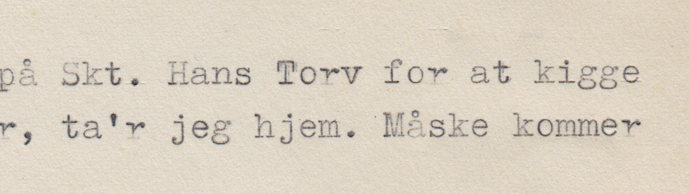
@ James: they did use typewriters – but also a lot of handwriting. I'm reluctant to post text and illustrations from the book, as it is not yet approved, but I can share with you a little piece of sixties typewriting: several little notes like this one, "just left - will be back later"-sort of notes, survived all these years and I feature some of them in the book. They feels like text messages from 50 years ago.
@ riccard0: yes. The lines are blurred – and the texts not always visually separated. Century – that might work!

Thanks again.

> @ James: they did use typewriters – but also a lot of handwriting.

I agree. I'm just saying it's not like today when everyone has a computer. Many folks didn't even own a typewriter. I was the editor of a newsletter in the 1970s and almost all submissions were handwritten.

I'm not saying that typewriting is a bad idea. I'm just saying that you might want to mention why a beatnik is using one.

The Last Whole Earth Catalog (1971) was assembled using photocopies and IBM Selectric type.
What typefaces best approximate the quality of “golf ball” typography?
I would suggest my Brown, for its patina of distress, although metrically it is consistent and without bounce.

@ James, they did a lot of writing in her "group". They published a magazine.
And both her parents were writers. You mentioned social class, and when they met in the 1940, her mother, who came from a middle class family, owned a typewriter, while her father, coming from a working class background, didn't. Her's was an Erica/Erika – I know that.
@ Nick – I like it Brown. It's has this slight vintage-tint. I like it. And nice story about WEC.
It's hard to make the typewriter-/monospace/slab work with a serif, so I think it must be a sans. Brown could mix nicely, I think. If anything, perhaps I could use something a little more ...casual, perhaps. But it is a good suggestion.

Sounds good.

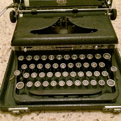
Incidentally I've got a bunch of old ones that belonged to my dad, who did some writing. Nothing fancy, this is an old Royal still in it's carrying case.

Captured from web.archive.org on 18 Apr 2015. view this capture