Typophile

Pure, Unadulterated, Adulterous Latinization

Hrant H Papazian

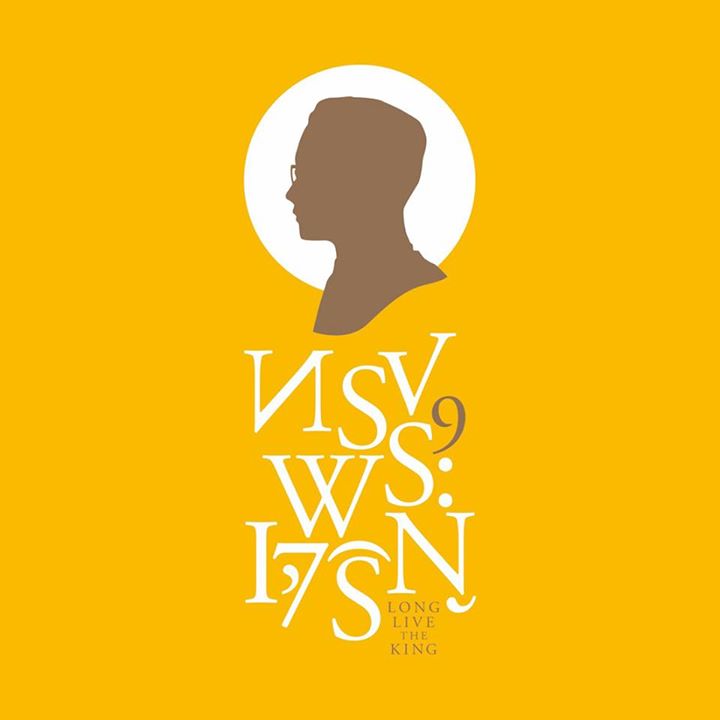
Ben Mitchell alerted me to this:
https://www.facebook.com/photo.php?fbid=10152540802495665
I mean, I'm tempted to get a Facebook account just to ask the guy WHAT THE HELL IS WRONG WITH YOU?! I mean, wait for the king to die first so at least he merely turns in his grave.

BTW, the actual Thai text: ทรงพระเจริญ
hhp

Perhaps it's just mockery, done using a Thai equivalent of http://www.google.com/search?q=crazy+text+generator
We don't get the joke because it's lost in (visual) translation.

I wish I could believe that. It would actually make some delightful sense if King Bhumibol were a berserk Westernizer (like Mongkut was) but I don't think that applies here.

hhp

This is completely awesome and completely genuine. The designer works at Siam Type and they were selling t-shirts with this design. (There's also no way anyone would make a mockery of this subject in Thailand.)

Though this recycled-Latin chic is really common on Thai versions of Hollywood movie posters, I find it really fascinating that they'd choose to use not a single Thai letter for such a national occasion. Clearly all these glyphs are Latin characters reappropriated (with one modification, the V is stretched asymetrically to form ง.) I just love the unapologetic way the parenthesis and comma are used for the vowel mark ิ and tail of ญ respectively, it's just so naive and cheeky, and bizarre! I need to think some more about this.

There's also the possibility there's some rationale behind the Latinisation here: the king was born in the States. I doubt that was the thinking though.

Given that this is display typography, yes, different rules apply. If this sort of faux-Latin Thai were used for text typography, even if the people of Siam were able to read it, I doubt it would fly.

The Indic scripts, although very diverse visually, approach isomorphism in structure - most of them can be used to write Sanskrit, although they may include additional letters for that purpose not used in writing the languages to which they belong.

One could imagine, therefore, that eventually one single script might replace the existing scripts used from Tibet to Thailand, from Sri Lanka to Laos. I don't think that's particularly likely, as a common script won't do much to surmount the language barriers in that region, and in today's age of digital fonts and laser printers, it's not as if supporting different scripts is an intolerable economic burden somewhere.

I think it's certainly creative, but in a context outside of navel-gazing graphic design, not at all "awesome"; in fact to me it's even worse than typing a language in a foreign script (generally out of convenience, like on a portable device*). It's the sort of thing we wouldn't like to see what I call a "Latin supremacist" (like Morison) do – what does it matter if the person is Thai? The people seeing it, the people affected, don't care much about such origins. Mostly they feel that "Latin is better than Thai".

* But sadly not only: http://instagram.com/p/tifcvLCTPH/

There's also no way anyone would make a mockery of this subject in Thailand.

But wouldn't it be "covert" enough to escape prosecution?

If this sort of faux-Latin Thai were used for text typography

Actually the display-to-text "trickle down" happens as a rule. When it's applied with enough subtlety. To escape conscious rejection.

hhp

>The people seeing it, the people affected, don't care much about such origins. Mostly they feel that "Latin is better than Thai".

I don't think so. The Thai script is especially adaptable and as we saw this week in the Flickr group Cross-script letterforms, it can withstand not only Latinisation, but Hangeulisation, Sinification, Japaneseification, Bengalification and Devanagarisation. Thai popular culture loves imitation, it's not really a question of foreign things being better, rather that there are things outside of Thailand that Thais want to appropriate and offer their own unique take on. It's more a question of pick'n'mix than pushing things in any one direction. That makes it often very indiscriminate and muddled, superficial and nonsensical, but also very fast-moving, vibrant, non-judging and fun.

I like the comparison with Morison and wonder about how he would have approached Thai. We'll never know of course, but looking at the way he brutalised Greek I have some ideas. His approach seems to have been very sober and practical, using a repertoire of Latin-ish shapes to compensate for a lack of understanding of Greek letterforms. I don't think he would have had the guts or the imagination to go anywhere near this far. Yes, this recycled/repurposed Latin Thai is reckless, but I find it somehow delightful in its complete abandonment of Thai shapes. In a way, they demonstrate such familiarity with Thai letterforms that they can be done away with, abstracted so far that they're not there at all: their presence must be inferred from the Latin letters that stand in their place. To me, the way this is executed is something only a Thai designer could have come up with, which paradoxically makes the whole thing quintessentially Thai.

I can certainly appreciate the benefits of joyful imitation; it's something that has made Western cultures richer, hence stronger. I do fear however that imitation can be used to [mis]guide discontent. Right now for instance there's a vacuum of governance in Thailand, and people in power can use visual language to push the country in a political direction that suits them, to the detriment of culture. This includes co-opting well-intended imitation to eventually make even Thai text fonts copy the forms of Latin with little regard to what they actually need to be doing, culturally, functionally.

Basically to me any design effort comes with responsibility, beyond the personal joy it brings. Back when I myself used to make Latinized Armenian fonts, I was so happy with and proud of my "formal gymnastics" of moving shapes around; but then I realized that was a very superficial approach and opened my eyes to the damage I was doing, without however reverting to the conservatism of blindly reviving tradition. That said, it's certainly a tough balancing act, which I will never completely master.

hhp

As I noted in another thread, I'm beginning to get an understanding of what is going on. Chanik Aramian apparently came up with the earliest influential Latinized Armenian face, and it looks as though he did so because the traditional faces seemed to need a breath of fresh air.

From what I've learned earlier about conditions in the diaspora as against the homeland, it looks, though, like there's going to be little demand for better Armenian typefaces. The homeland doesn't see anything amiss with heavily Latinized faces - they're what they're used to.

(Although the phonetics of Western Armenian, unlike Eastern Armenian, are such that it doesn't need all the letters of the Armenian alphabet - Latin would be adequate for that version of the language - at least there is no danger of that happening. The influence of the church, a naturally conservative institution, contributes heavily to the survival of the Armenian language at all in the diaspora.)

Some of the diaspora prefers the traditional faces without change, and some of it apparently doesn't mind the Latinized versions. Without demand in the community, expecting Monotype or Microsoft or Google to see that anything's wrong is difficult.

Still, typefaces that attempt to meet your goals may sneak in to Google's font collection, and maybe they'll even get noticed.

Thai popular culture loves imitation, it's not really a question of foreign things being better, rather that there are things outside of Thailand that Thais want to appropriate and offer their own unique take on.

Perhaps Asia in general. I know there is a lot of imitation of paintings in China as well. They just love to copy and often interpret art pieces in their own way. The reproduction of the German brand Tempo is particularly interesting.

Watch this documentary on brands from 1:50 to 4:00: http://www.npo.nl/nep/11-05-2012/NPS_1199474
It's Dutch but they talk English in that scene. Here's a video on art imitation from the same series (mostly Dutch again): http://www.npo.nl/nep/04-05-2012/NPS_1199472
In the latter half they focus on China.

I'm not familiar with Thailand's culture but it seems perhaps in Asia in general they have very different ideas about imitation. Perhaps it's just a very Western sentiment to be concerned with authenticity.

Let’s not make it a cultural stereotype.
A counter-example: http://en.wikipedia.org/wiki/Japonism

@hrant, do you yourself know how to write and speak Thai? If you don’t, then I don’t think it’s safe to just assume that visual mutation is a wrong or indecent thing to do.

I'd say language skills are a different kettle of fish. More important is an understanding of Thai culture (its traditions and its popular culture), design trends, especially typographic ones, and a nuanced appreciation of the different kinds of Latinisation. That said, it's certainly helpful to be as familiar with Thai letterforms as possible, both in the many genres of type and in handwriting.

Not understanding the Thai language, I can only guess at the legibility of that poster. I doubt that it's saying that Latin is "better", but it might be saying that Latin is more dignified, more suited to contexts where refinement, elegance, and prestige are needed.

The economic power of the Latin alphabet nations mean that a lot of typefaces have been around for it for a long time. And the model for capital leters in Latin serif faces... is the Trajan column, erected to proclaim an emperor's achievements. So our script is well-adapted to announcements on behalf of royalty.

When I see some of the Indic scripts, I tend to associate them with the hand-painted signs of small businesses; colorful, and following a standard writing model.

If one tries to style a script to say something else, the Latin script provides a lot of ready-made models. A post here, I think by Hrant, showed a link to how this sort of thing can be done the right way -

http://blog.daltonmaag.com/arabic-latin-logo-matchmaking-workshop/

If one tries to style a script to say something else, the Latin script provides a lot of ready-made models.

I tend to agree, but the link you provided I consider to be about a different principle. It's about stylistic translations from one script to the other. Certainly you couldn't call the Thai design above a stylistic translation. In fact, there is a total disregard for any translation. It simply uses symbols to mean something entirely different. It's conversion rather than translation.

Well, since the image for this thread is doing things the wrong way, it's not surprising that it's not similar to the images in the link in my previous post.

Using glyphs from another language that vaguely resemble letters in one's own language well enough to be recognizable... has been done by Latin alphabet users as well.

Well, since the image for this thread is doing things the wrong way

The wrong way as perceived by Westerners, anyway. Besides, it's not actually a typeface but an artistic work of typography. I feel a lot more liberties can be taken there.

Using glyphs from another language that vaguely resemble letters in one's own language well enough to be recognizable... has been done by Latin alphabet users as well.

Do you know of some examples by any chance?

Do you know of some examples by any chance?

Well, it’s the whole point of the “crazy text” generators I linked to in my first post.

For some reason I skipped over that link. Quite interesting.

It was only a matter of time, I suppose, before a country declared war on a corporation over a script, but there you have it.

It was only a matter of time, I suppose, before a country declared war on a corporation over a script, but there you have it.

I'm not sure where North Korea and SONY come into this...

Captured from web.archive.org on 14 Apr 2015. view this capture