
Hi all,
Can anyone identify the font used in this infographic? I guess you can call it an infographic. I think there's just one font used. If you click on the image it zooms to a hundred percent.

Many thanks in advance.
Hi all,
Can anyone identify the font used in this infographic? I guess you can call it an infographic. I think there's just one font used. If you click on the image it zooms to a hundred percent.
Many thanks in advance.

I think it's various weights of Proxima Nova with some alternates turned on (e.g. lower case 'a').
- Lex
Hi Lex, thanks for replying, that's what I thought initially but when I checked it the large numerals appear to be different. Isn't there another font being used too?

The numbers look DIN-ish in construction. Similar, but not a match: http://www.myfonts.com/fonts/tdf/galeb/
The closest I can come on the numbers—and it’s not a spot-0n match—is Antagometrica:
http://www.myfonts.com/fonts/bitstream/antagometrica/
The bowls of the numbers in the sample are nearly round, and finding that paired with a squared-off |0| and that |1| has proven to be a challenge.
That was my first reaction, maybe I'm better at recognizing fonts than I thought :) If most of the document is Proxima Nova that's a partial success at any rate.
Can't identify it either but... digged a bit more and found the Proxima Nova webfont on their blog embeds the exact same set of digits as the infographics. As this information gets this case even fuzzier, your best chance now may probably be asking them directly.
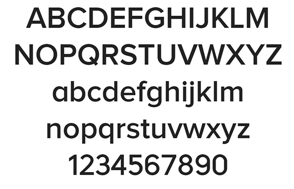
Okay thanks for looking into it for me. It looks like they replaced the numerals with a different font then. That would explain why it seemed unusual :)
It looks like they replaced the numerals with a different font then.
Exactly but it doesn't solve the mystery either :) Hope they could give (us) the answer.
Captured from web.archive.org on 15 Apr 2015. view this capture