Typophile

First Awesome Font for a student!

oolong_tea

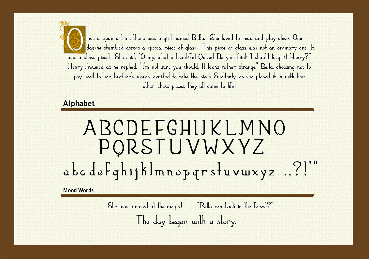
As my first official font, I would love some critique on the typeface. I am currently a student, and I would really like your opinions on this "story book" like font. I tried to add a gap on lowercase for a child-like appearance.

I would appreciate any comments.
Thanks
Any comments or critique would be great!

I like the overall feeling. However, the gaps placement seems pretty arbitrary. Also |U| looks boxy, and |X| doesn't work for me.

I like it - it has a clean gentle Beatrix Potter feel. The extremely small x-height does not hinder legibility . The |f| is incongruous with its prominent capital-F-like stroke. The irregularity of the shapes is pleasing and gives a hand-made effect .. it reminded me somewhat of the new font being promoted for easy reading by dyslexics who cannot recognise symmetrical shape like q,p,b,d, so the glyphs are made irregular. The gaps are OK and might well serve another purpose - someone on typophile was recently looking for a font without closed counters for laser cutting. Good luck.

Thank you for your feedback! Will work on it!

Thank you for your feed back! I will def. work on these elements!
I appreciate your detailed comments!

The 'f' really interrupts reading to me in your sample. It looks too much like a capital letter. The apostrophe and quote marks seem slightly too high to me.

Hey oolong no need to change the bd pq letters in case you misread my comments about the dyslexic font.

Captured from web.archive.org on 17 Mar 2015. view this capture