Typophile

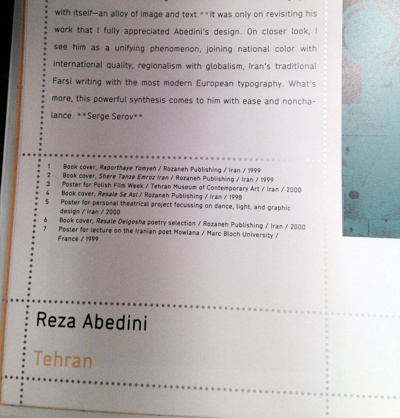
Custom font by Nico Schweizer....close match?

jilljill

Hello Everyone,

I am in love with a custom typeface by Nico Schweizer created for Phaidon's publication of Area. It is called Typ 1441. Lineto sells Schweitzer's Typ 1451 (http://lineto.com/1.0/content_5.html) but it is too wide for my purposes (a design c.v.). I was wondering if anyone could recommend a close match?

Thanks much.
Font: 
DIN
Solved By: 

The whole point of a custom typeface is that it’s unique; the following suggestions are decent substitutes based on overall form and proportions, but may miss on some of the details (DIN comes closest on both the numerals and the letters).

ITC Conduit:
http://www.myfonts.com/fonts/itc/conduit/

Modus:
http://www.myfonts.com/fonts/garagefonts/modus/

DIN Text Condensed, by Parachute:
http://www.parachute.gr/typefaces/allfonts/din-text-condensed-pro

Thanks KThomps. I keep coming back to DIN for my project, and then avoiding it again b/c I'm worried that when the text is read by Germans it will conjure street signs. But I like the Parachute families. Thanks.

You could commission a custom font from Lineto, or another foundry. Or you could modify Typ 1451, but: it's not easy to do a clean job; you have to make sure the results don't leak out to the world.

DIN does indeed have too much baggage.

hhp

Some more food for the mind jilljill: Netto, Isonorm, Rubrik, Speak, Chevin, Mic32 New, Dosis (good for text?), Bariol (see Dosis)

Captured from web.archive.org on 17 Mar 2015. view this capture