
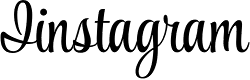
Instagram's old logo

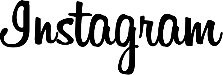

I would be interested in opinions as to which digital font is closest to the new logo.
Thanks.
Don
| Attachment | Size |
|---|---|
| InstagramLogoRemakeByMackeySaturday.jpg | 30.14 KB |
Instagram's old logo
| Attachment | Size |
|---|---|
| InstagramLogoRemakeByMackeySaturday.jpg | 30.14 KB |

My 2 cent... I'm not great fan of this rework. It gives the impression of exactly what it is, a rework. /m and /n look out of the scope now, still too close of Billabong's, /n and /s feel unbalanced together (don't like the way /s x-height has been reduced to be aligned with the rest), /g loop and following /r look weird creating a big gap probably because the designer wanted to keep the tracking (making /g leg longer and reworking loop).
That said you may like to have a look to Seniors and Artimasa fonts, 2 fresh and new foundries.

Artimasa’s Authentica, though, is a shame, more so with a name like that… (see http://www.losttype.com/font/?name=wisdom_script).
It makes one wonder about the legitimacy of the other designs too.
Edited:
Many thanks to both of you for the font suggestions. Quite helpful.
Ryuk, your critique is perceptive Gives me a better insight into the merits, or perhaps demerits, of the redesign. I agree a cursive style _s_ works better when it is allowed to punch above the X-height. The cursive letter _r_ is always a problem. Handling the _gr_ link is particularly difficult. Should the tail of _g_ snake up to follow the pattern of letters like _a_ and _e_, compare to Aaron Script by Seniors
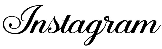
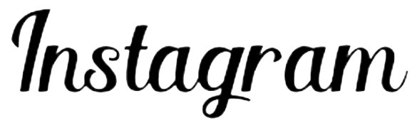
About the Instagram reworking, I understand the need to smooth the logo down and to make it more a logo and less a word set in a nice font. But I think the result took away too much of the liveliness from the original. In this regard, for the g_r pair probably a more “twisted” curve would have helped (less tame loop for |g|, less wide counter for |r|, a bit like your Fertigo Script sample*).
As for Authentica, it’s not the first time someone is called out for ripping off Wisdom Script (see http://typophile.com/node/93171).
If you need to “improve” upon an existing script, at least do it with something which allows it (example: https://www.behance.net/gallery/Blenda-Script-Free-Font/13832171).
* Although in Fertigo |g|’s loop could look a bit cramped, and the joining a bit thin.
Good point: liveliness vs. regularity in script font design. This seems to me to be perhaps the most difficult issue for a script font maker. The new _Instagram_ logo does indeed seem to emphasize regularity at the expense of liveliness.
Blenda Script as a remake of Lobster -- one of the most successful font designs of recent years -- is not close to _Instagram_ because it is too crisp and regular for a match. Is it an improvement? Perhaps. In any case, It looks like a good font for some uses.
Thanks for the comment on the _gr_ pair issue.
Don
Sorry to somewhat hijacking the thread, my links were intended to illustrated points only tangential to the main topic.
On the question on which digital font is close to the revised Instagram logo, I’d say that the closer general style is the modulated-but-not-too-contrasted upright brushy cursive favoured by vintage advertising, sign painters and phototype.
Some examples:
http://www.myfonts.com/fonts/typesetit/style-script/
http://www.myfonts.com/fonts/sideshow/impala-script/
http://www.myfonts.com/fonts/bomparte/retroscript-bf/
http://www.myfonts.com/fonts/underware/liza/
http://www.myfonts.com/fonts/suitcase/bistro-script/
http://www.myfonts.com/fonts/mika-melvas/alina/
A few by Filmotype:
http://www.myfonts.com/foundry/Filmotype/
A lot by Fenotype:
http://www.myfonts.com/foundry/Fenotype/
As for the digression, g-wizz, I thought it was interesting.
This is where ligatures help. Compare Style script with Style Script Pro
Captured from web.archive.org on 17 Mar 2015. view this capture
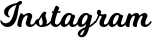

Similar feel to Tartine Script
or Fertigo
https://www.myfonts.com/fonts/exljbris/fertigo-pro-script/
or SauberScript
https://www.myfonts.com/fonts/typejockeys/sauber-script/
for some letters, but is there something closer?
Don