
Can anyone identity the font used for "BAKERY" and "RESTAURANT" in this sign? If not a font/typeface, would you please recommend something similar?
It would also be great to know what script (or a similar one) is used for Ahrens. Thanks very much.
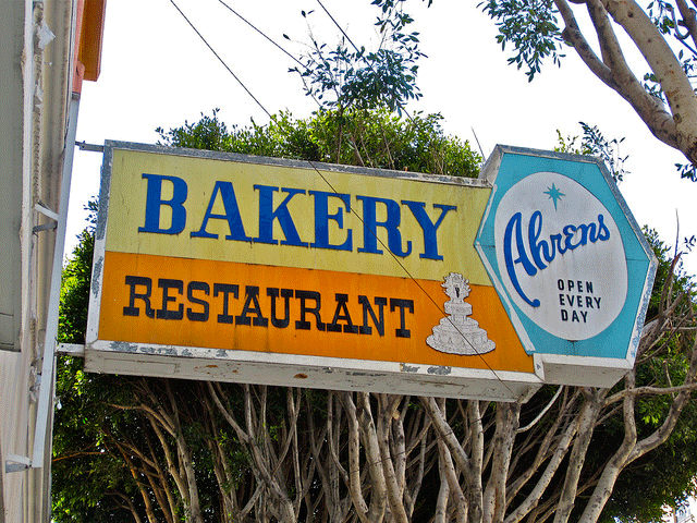
Can anyone identity the font used for "BAKERY" and "RESTAURANT" in this sign? If not a font/typeface, would you please recommend something similar?
It would also be great to know what script (or a similar one) is used for Ahrens. Thanks very much.
Had no luck finding something that completely matched Bakery. These two typefaces get most of it right, save for the squared-off |B| and |R|, and the fully flat-topped |A|:
http://www.myfonts.com/fonts/type-together/abril-titling/
http://www.myfonts.com/fonts/storm/trivia-serif-10/
I found a similar |B| in a typeface that used to be offered by Linotype, Myfonts, and Fontshop, but now I can only find dubious sources for it:
http://fontsgeek.com/fonts/Napoleon-Light-Bold
Ibis, by Font Bureau, might be helpful for the |B| and |A| as well:
http://www.myfonts.com/fonts/fontbureau/ibis-display/
Thorowgood also gets the flat-topped |A|, slab serifs, and the curly-footed |R| right, and would only require some artificial widening and some squaring off of the |B| and |R|:
http://www.fonts.com/font/wooden-type-foundry/thorowgood/regular
These might work for Restaurant:
http://www.myfonts.com/search/Alcalde/fonts/
http://www.myfonts.com/fonts/linotype/westside/
http://www.myfonts.com/fonts/intellecta/french-clarendon-n2/
Ahrens is most definitely hand-lettered, but these script faces capture the same general feel:
http://www.chank.net/freefont_detail.php?sku=1080
http://artandsignstudio.com/signwriter.html
http://www.myfonts.com/search/az+cupcakes/fonts/
http://www.myfonts.com/fonts/fenotype/no.-seven/
http://www.myfonts.com/fonts/canadatype/wonder-brush/
http://www.myfonts.com/fonts/typesetit/praise/ [Swash]

BAKERY. Another squared bowls font, designed by by Wolff Olins in 1978 for Renault automobiles. The matching weight is somewhere between Renault Medium



Also similar for “BAKERY”: http://www.myfonts.com/fonts/typodermic/bullpen/
Captured from web.archive.org on 17 Apr 2015. view this capture
BAKERY is interesting. Some letters are almost a perfect match for Abril Titling Bold but the bowls on _B_ and _R_ are squared in a style developed by Imre Reiner as Corvinus in 1929-34. So what changes to Abril would produce an alphabet that was consistent with BAKERY?
Consider Abril Titling Bold BRSPDCG
Compared to Corvinius BRSPDCG Skyline
Don