
Typophile
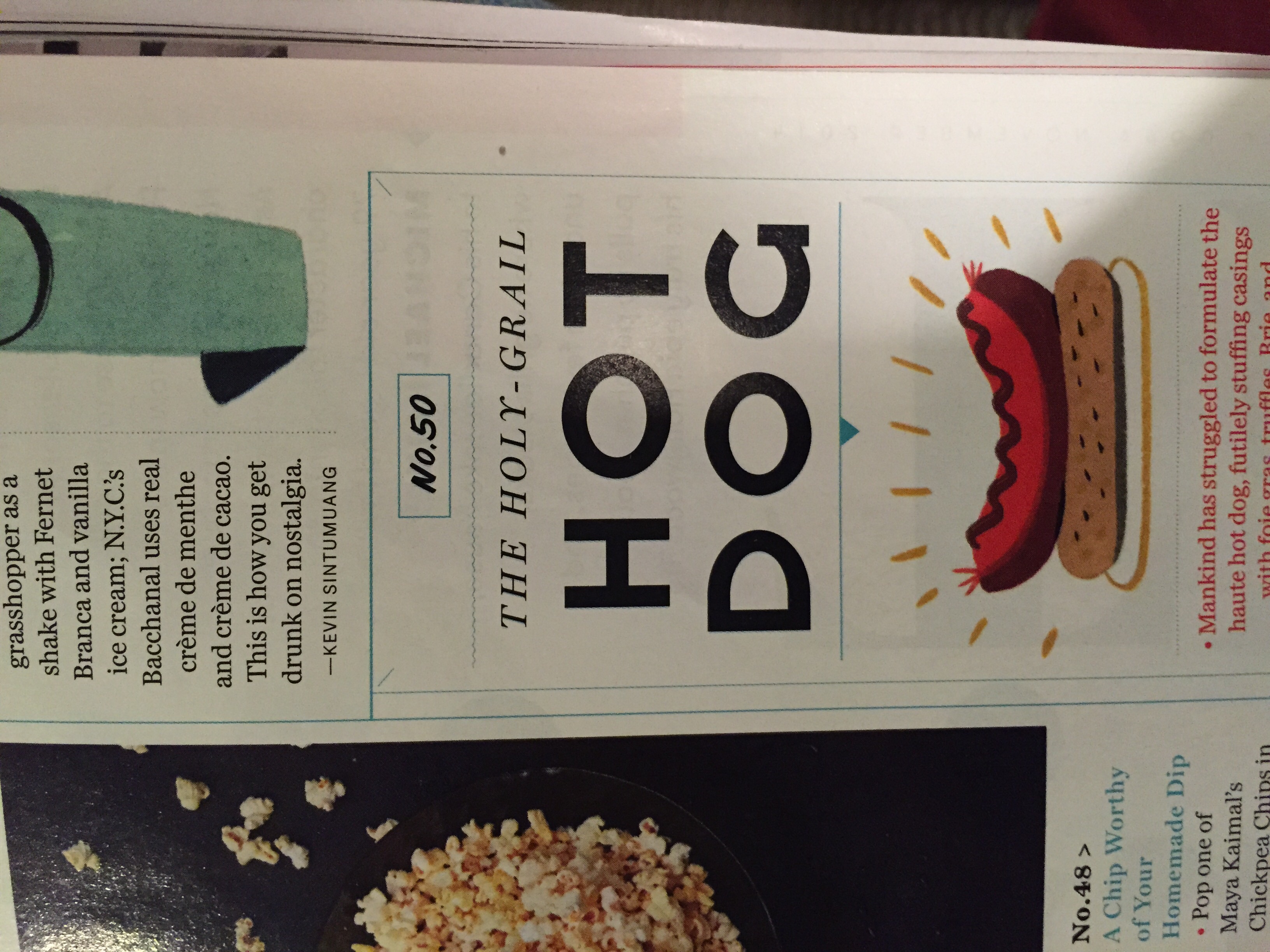
November GQ font

I think this may be Montserrat, a free Google web font, that someone artificially widened and shortened (check out the |O|). The G is from Montserrat Alternates:
http://www.google.com/fonts/specimen/Montserrat
http://www.google.com/fonts/specimen/Montserrat+Alternates

Captured from web.archive.org on 17 Mar 2015. view this capture