
Looking at the headline on this one. Possibly wood type? Anything close to it in digital?
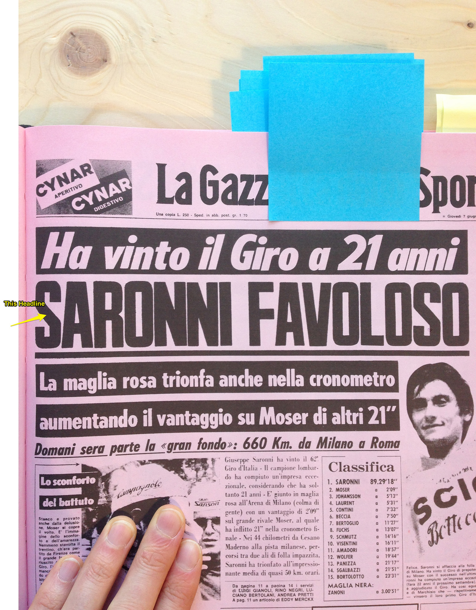
Looking at the three faces in this image. Perhaps these are metal or hot-metal face? Not sure when Italian newspapers went to offset or photo type.
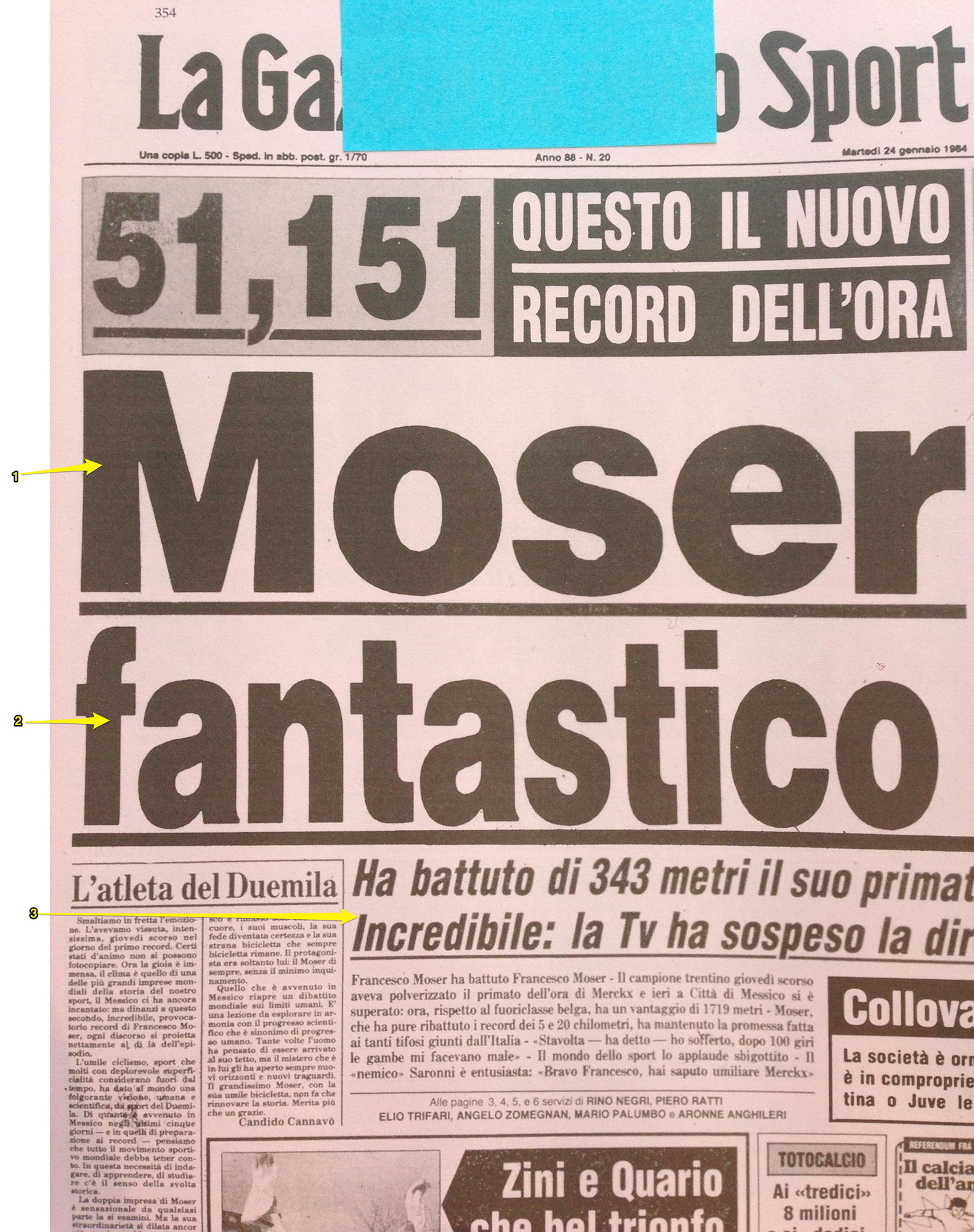
Looking at the headline on this one. Possibly wood type? Anything close to it in digital?
Looking at the three faces in this image. Perhaps these are metal or hot-metal face? Not sure when Italian newspapers went to offset or photo type.

I thought I'd post the one sample in black and white with a little perspective correction in case it helps.

It looks like Soft Press by Canada Type is pretty close to your sample though not exact.
@tylor.reimer - Thanks. It looks more like Press Gothic than Soft Press likely due to softening of type/process of newspaper printing. The original face may be Metropol designed by Aldo Novarese for Nebiolo in 1967.

It looks like Soft Press by Canada Type is pretty close
So perhaps it’s Metropol (see the description here: http://www.myfonts.com/fonts/canadatype/press-gothic/).
Edit: I’m slow, and don’t refresh pages.
Thanks to those who have offer suggestions and help so far. The biggest issue I am running into is that these were either wood, metal, or hot-metal typefaces that were then printed on cheap newsprint. Some of them have been digitised, but not 100% EXACTLY like the original versions.
So far, this is what I have found:
SARONNI FAVOLOSO
Actual Typeface: Metropol designed by Aldo Novarese, released by Nebiolo in 1967
Best Digital Equivalent: Press Gothic Pro - http://www.myfonts.com/fonts/canadatype/press-gothic/pro/
MOSER
Actual Typeface: Metal Helvetica Black?
Best Digital Equivalent: Neue Haas Grotesk Pro Display 95 Black - http://www.myfonts.com/fonts/linotype/neue-haas-grotesk/pro-display-95-b...
FANTASICO
Actual Typeface: Condensed metal Helvetica? (this was the most difficult to match digitally)
Best Digital Equivalent: Helvetica Neue 87 Cond Heavy - http://www.myfonts.com/fonts/linotype/neue-helvetica/helvetica-87-heavy-...
HA BATTUTO DI 343 METRI
Actual Typeface: Hot-metal Helvetica Condensed Bold Italic?
Best Digital Equivalent: Helvetica Pro Bold Condensed Oblique - http://www.myfonts.com/fonts/linotype/helvetica/pro-bold-condensed-oblique/
Any additional suggestions or help is greatly appreciated.
Captured from web.archive.org on 19 Apr 2015. view this capture