
another mornin' - another show!
it's not that i am suddenly turned lazy - it's just that i need an expert eye…
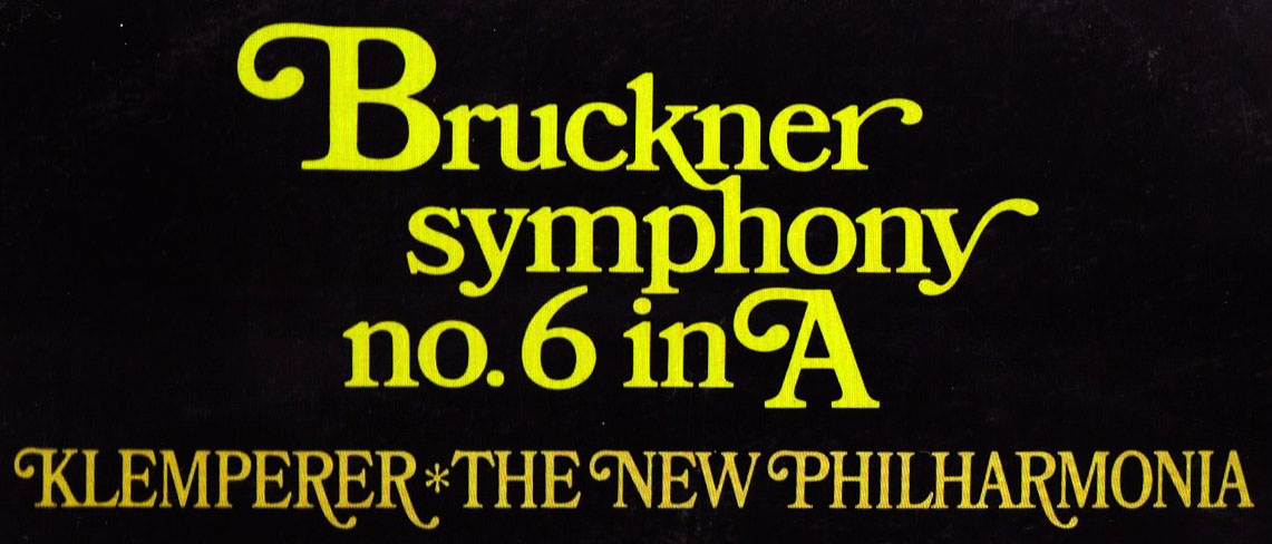
…but see for yourself:
i would say the top headline is a bookman font; the one closest is bookmania semi.
i cannot however find the fitting swashy letters.
bottom line looks more like a condensed bookman, also with swashes - pls note the steep capital_r; the stroke of the top swashes is going a bit upwards (just as in above line)
cover made in gb '65
(resource probably a scan with minimal distortion)
good luck!
Font:
Bookman(ia)
Solved By:
| Attachment | Size |
|---|---|
| 1111.JPG | 121.85 KB |
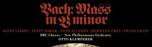


Vell, Vhat's Vrong Vith Vach? Vunderbar!
Don