
Hate to break it to you, but it is Founders Grotesk:
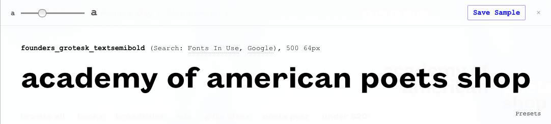

Where did that 'r' come from, Kevin? It doesn't appear in any of Klim's examples and the PDF doesn't show any alternates.

What kind of tool do you use, Kevin?
It's there, you have to go to page 28 (and the following pages) of the PDF, to Founders Grotesk TEXT.
I didn't dig too far into the code of the Academy of American Poets page, so perhaps they used the non-text version of Founders on that one character to get the less ornate |r| seen in the sample. Or maybe they had Klim customize the web font for them to align with their logo design.
Founders Grotesk Text is also where you will see the more open |c| that's visible in the sample.
And I just noticed that the sample has an |i| with a round tittle. That I can’t find anywhere in the character set. Also custom?
Thanks very much for the detective work. I'd gone to Klim's site but didn't go far enough...it was the /t/ that I didn't see in the samples I set...
But my first guess was Founder's, so I give myself partial credit...
Riccardo, I use a Firefox plugin called Type Sample to identify CSS-styled type on websites.
And cpkc, you are quite welcome. Thanks for the mystery to solve. There are enough differences between the text and standard versions of Founders Grotesk to see why you were skeptical, and the logo itself mixes and matches fonts within the family (the |r|, for example; plus, it uses a custom dot over the |i|).
Captured from web.archive.org on 17 Mar 2015. view this capture
