Typophile

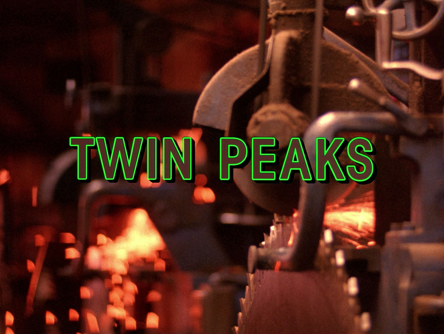
Twin Peaks intro credits

Pico

Hopefully, this can be settled once and for all. It's been identified as ITC Avant Garde Gothic Condensed Demi Bold at another message board, but the K doesn't match.

Video with samples here: http://www.artofthetitle.com/title/twin-peaks/

Font: 
ITC Avant Garde Gothic Condense (Demi Bold)
Solved By: 

ITC Avant Garde Gothic Condense (Demi Bold) looks fine, including the |K|.
Take a better look, some weights of Avant Garde Gothic have a different |K but Condensed Demi Bold looks like an exact match.

That's odd, I must have looked at another version. Oh, well - thanks!

Simila to... Arial

Captured from web.archive.org on 17 Mar 2015. view this capture