
Solved By:
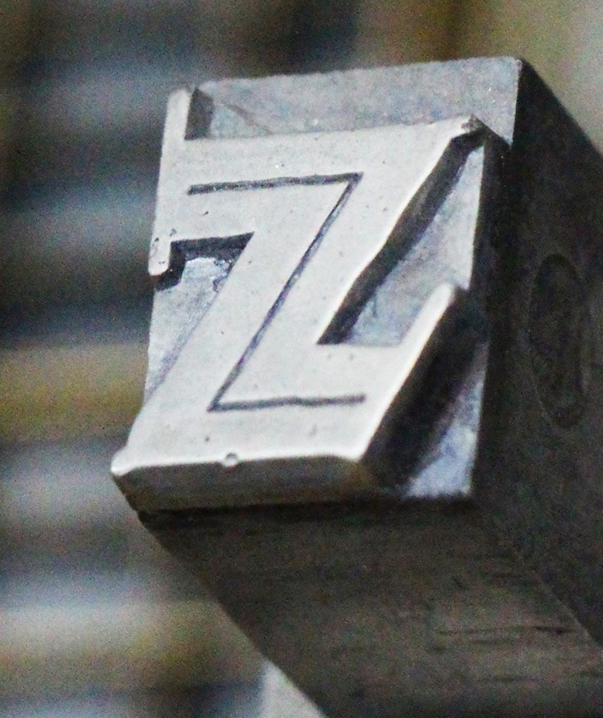
It's cast in metal, so it predates the advent of phototypsetting (c. 1950).
Looks like an art deco inline display face, but I've had no luck with an ID.
My attempt at a somewhat clearer image, if someone else wants to take a crack at it:
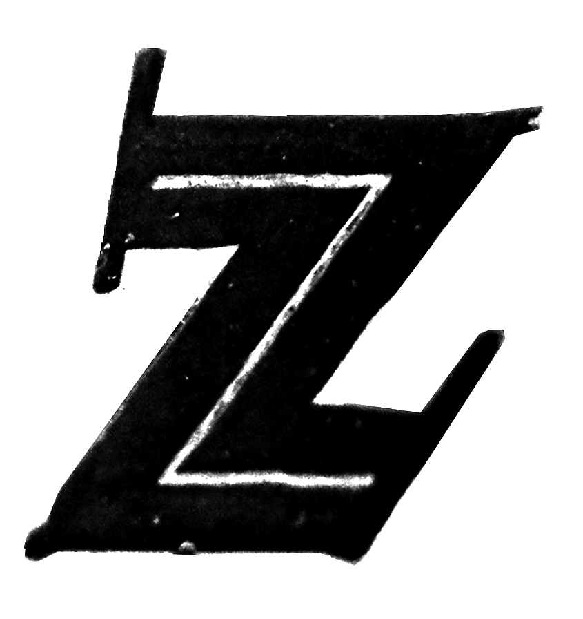

It's similar to Ashley Crawford Inline, but I don't think that's it...
I had the exact same thought, Nick, but Ashely lacks the exaggerated serif details.
If it was a metal typeface, it had to be mass produced. I'll have to check my type specimens....

The different angle of the terminals reminds me also of Neuland Inline (minus the serifs).
At least the FFD cut: http://www.fonts.com/font/monotype/ffd-neuland/inline?SiteId=15
Maybe interestingly, the non-inline cut of Ashley Crawford has more pronounced serifs than the flared ones of the inline version (albeit not as straight as the sample).
Captured from web.archive.org on 17 Mar 2015. view this capture