Typophile

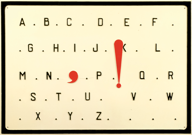
Marcel Broodthaers 1970 vacu-form artwork

hypepilot

I would be very grateful if someone could identify this font or something very similar.

Thank you in advance.

h.p.

Font: 
Custom die-punch typeface
Solved By: 
AttachmentSize
Broodthaers21020802.jpg158.22 KB

.

Given the date of the original and the manufacturing process, the original was most likely a custom die-punch typeface (they actually look like the sort of letters you'd draw with an architect's lettering guide). Here are a few contemporary digital fonts that may help you replicate the look:

http://www.myfonts.com/fonts/jnlevine/slim-james/ [you'd have to artificially expand it]
http://www.myfonts.com/fonts/ef-typeshop/diamante/
http://www.myfonts.com/fonts/softmaker/diamante-serial/
http://www.myfonts.com/fonts/marksimonson/refrigerator-deluxe/
http://www.myfonts.com/fonts/fontbureau/fb-agency/
http://www.myfonts.com/fonts/processtype/stratum2/
http://www.myfonts.com/fonts/castletype/agency-gothic-ct/
http://www.myfonts.com/fonts/fort-foundry/industry-inc/
http://www.myfonts.com/fonts/fontfont/oxide-pro/

And, of course, there is the old standby, Eurostile (condensed):
http://www.myfonts.com/fonts/adobe/eurostile/

Good suggestions Bob and Kevin.
Almost looks like license plate letters in a jurisdiction where the need to squeeze in more than a few letters allows this width. But the _Q_ is a disaster. Too close to _O_ -- ignore the comma, _O_ would look like _C_ with the gap closed.
BTW looking at _J_, _M_, and _W_ leads me to believe that this is monospaced.
Don

The key is the slight step back on the upper part of the B - that is why Neutraliser Sans will get you close.

Wow!

Thank you so much for this. It is very much appreciated. I really like the industrial machine look of it. Neutralizer and Stratum2 look pretty good to my eye.

I like Don's comment about the Q being a disaster!

I am going to hold off marking it as resolved just in case a few more suggestions come in.

h.p.

Based on Kevin's (kthomps5 ) thoughts of "the sort of letters you'd draw with an architect's lettering guide"

I found this:

http://www.myfonts.com/fonts/nowak/engineer/regular/

Does anyone know of anything else that might be similar?

Take a look at these license plate fonts. I have not included the ones with serifs or the ones that are significantly wider than your specimen.
Driver Gothic
http://www.myfonts.com/fonts/canadatype/driver-gothic/
BF Corpa Gothic
http://www.myfonts.com/fonts/brassfonts/corpa-gothic/
Vehicle JNL
http://www.myfonts.com/fonts/jnlevine/vehicle/
Penitentiary Gothic
http://www.myfonts.com/fonts/ephemera/penitentiary-gothic/
Don

Thank you very much Don!

Hey I just want to say that I wanted to resolve this an give credit to

kthomps5
donshottype
bojev

Because the lettering appears to be custom-made and thus all their suggestions are greatly appreciated.

It doesn't appear that I am able to credit all.

h.p.

Captured from web.archive.org on 17 Mar 2015. view this capture