
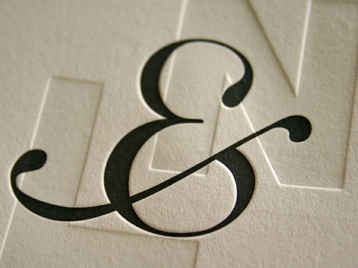


Bet it is photo polymer letterpress and maybe started out as Illustrator art work.
I think you are correct Bob. I have been collecting interesting ampersands for years and I don't have this one.
But there are now many well styled fonts that would harmonize with this ampersand, so I will keep an open mind.
BTW, I like the design. Worth including in an appropriate swashed Roman with similar terminals.
Don
I agree Don, it is a very nice variant on the ampersand.
Unfortunately, when the image is corrected for rotation, skew and perspective it looses some of its extravagant swash and is not quite so dramatic


So, do either of you have a suggestion as to what the base font might be (I suspect it's a custom creation, but it has to be based on something)?
After editing out the swash, Seravee is the only near match that I could get (and it only comes somewhat close):
http://www.myfonts.com/fonts/stawix/seravee/
Maybe started with a reversed 3 - I will look into that.
Or an _8_.
Don
you guys are like detectives. :P
I found it here: http://www.beastpieces.com/2011/12/an-oversized-wedding-invitation/
Captured from web.archive.org on 10 Oct 2014. view this capture
Recent? Letterpress? Any info on source or date?
Don