
I assume that the core TrueType fonts like Times New Romand and Arial will be supplied with Windows 10. Does anyone know if there will be new fonts supplied with Windows 10?
I assume that the core TrueType fonts like Times New Romand and Arial will be supplied with Windows 10. Does anyone know if there will be new fonts supplied with Windows 10?

I didn't even knew that they would skip 9 altogether...

Just a recent announcement. They're catching up with OS X, or saying that they really should have made us pay for 8.1.
Before, there was a rumor that the version after 8.1 wouldn't be called "Windows". There was a thread with people joking about what they could call it instead. I suggested "Standard", after all, it's what people buy because almost all the third-party software is made for it.
But even the name "Akzidenz Grotesk" is taken. Well, there you are. They should include that as a replacement for Arial.

Rumor is that legacy code uses “windows 9” to judge the system version (Windows 95 or 98). To avoid dealing with this mess they just decided to use Windows 10.
I don't care for the number 9. So it's fine by me. Wonder whether we can expect some new fonts though.

It's true that people would refer to Windows 95 / 98 and Me as "Windows 9x" - I don't know if that relates to the naming decision.
Thank you for elaborating on the name of the new Windows. But could you also discuss possible new fonts?
I'm still hoping for Trebuchet Pro.
Yes, me too. Trebuchet is a good looking contemporary font. It ressembles Bliss. The only downside is that you can't use it for print body text because of the uneven spacing. Just like Verdana.
The Windows 8 version of Trebuchet contains the OpenType features found in the "Pro" version (AKA Trebuchet 2010). We didn't monkey with the spacing because that would break existing documents and web pages.
That brings me to another font: Calibri. According to Lucas de Groot he initially proposed a version without rounded corners. MS chose the rounded version instead. Why? One of the most given critique of Calibri is that it looks "childish" because of the rounded edges.
De Groot redesigned the font, taking out the rounded corners. When submitting the proposal to Microsoft, he sent along a sample of the original version, adding: ‘I like the look of it, but as you see these rounded tops look real ugly in ClearType; don’t choose this.’ De Groot had in fact been critical of the ClearType rasterizer when he first saw it demonstrated.
To his astonishment, Microsoft chose the rounded version.
Also to my astonishment... Anyway, can we expect a Calibri without rounded corners? Maybe as an OpenType feature? Lucas de Groot already designed the font without rounded corners, so it might cost half the effort. Just sharpening the edges would not cause reflow issues. Besides, Windows 8.1 also came with another Calibri variant, Calibri Light.
"One of the most given critique of Calibri is that it looks "childish" because of the rounded edges."
This narrative has not gained any significant traction as far as I'm aware.
Maybe Calibri won’t look that bad with the new rasterizer in DirectWrite.
Or you could say Microsoft has this super long, elaborated scheme to implement DirectWrite in their future when they chose the rounded version.
—
Now I know why I hate Calibri: because it’s rounded.
Now I know why I hate Calibri: because it’s rounded.
Yes. In essence Calibri is a good looking font. Well usable for print. It ressembles TheSans also designed by De Groot. TheSans is very popular in The Netherlands. If only MS would have chosen the non-rounded version...
Oooohhh. So there is a sharp Calibri. I soon want to see MS include this in the new release, which is… possible? – given MS’s increasing attention to good typography. I mean, they even had Matthew Carter to design Sitka just for the browser reader, so anything could happen, right… ?
Yes. Anything is possible. I hope MS will include a sharp Calibri. Or just replace the current one. Like they did with Segoe UI. I don't think anyone would object to that. I still wonder what Si has to say to this proposal.
Oh, I forgot to mention. Besides, the rounded corners aren't visible when printing at size 11. Instead it makes the letters a bit 'runny' or 'fuzzy' if you understand what I mean. This isn't a reason to sharpen the edges of Calibri. Neither is it a reason not to...
It seems that Cambria, Calibri, and Segoe UI haven’t been updated.
There are bugs with the “centralized” and “breathy voiced” diacritic over the U+0261 symbol, for example.
The “breathy voiced” diacritic doesn’t combine well with the letter “e” either.

Sylph, can you provide specific test character strings so we can check this behaviour? -- 'breathy voiced' diacritic doesn't tell me what combining mark character you are using for this function.
John, thank you for replying!
The “breathy voiced” diacritic is “diaeresis below”, U+0324, and the “centralized diacritic” is “combining diaeresis”, U+0308.
Could you check it with the fonts listed above and Arial?
Use Segoe UI 10 pt bold.

Hi Slyph, can you provide scenarios for when this problem arises? I'm not familiar with the use of these characters.
Thanks!
Sylph, I see one problem with marks being too far left on some bases in Calibri, but no problems with the other fonts you indicated.
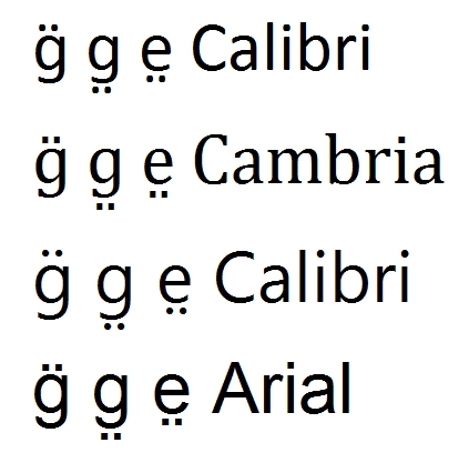
Also tested italic, bold and bold italic fonts, with same results.
Font versions tested, in Wordpad, Windows 7:
Calibri v5.72
Cambria v.5.96
Segoe UI v5.05
Arial v6.82

Martin, that’s Segoe, not “sharp Calibri”.
Ohh, that's embarrassing and disappointing. I was already wondering why the shapes and proportions changed so severely and seem to morph into Frutiger but I just went with it. In that case I can't imagine sharp Calibri working well for me either.
Any information about new fonts in Windows 10? Any leaks?
Captured from web.archive.org on 18 Apr 2015. view this capture
The sharp Calibri definitely looks better. I'm tired of seeing the rounded Calibri in very inappropriate contexts. A sharp Calibri is some progress already. At the art academy I'm at you can almost guarantee students will use DIN. If not, they usually don't care enough to change the typeface to something original at all and they go for the standard Calibri. Last week I saw it in a digital presentation where it was practically used as a display typeface. I got really frustrated seeing that. Calibri is a nice typeface, but it seems packing it with Windows inevitably leads to abuse of the typefaces. I'm actually surprised people at the academy aren't typographically versed enough to make an appropriate choice in typeface. They never really seem to care. Well, they're starting to discover Gotham now. They're late to the game but they will inevitably follow trends while they're supposed to think about their type choices.
Anyway, I see the sharp Calibri has bigger counters. That's good. I sometimes use Calibri in Word when I need to type out something before putting it into InDesign and I always felt the counters are too small. Especially with the rounded edges, the /a in particular looks very small.