
Hi genius typeheads -
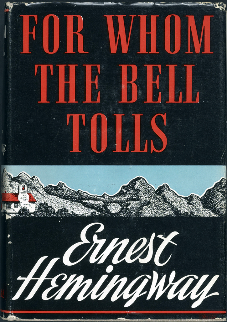
I'm trying to identify the FOR WHOM THE BELL TOLLS font used on this book cover - looks like a condensed Bodoni, but the R is very different...
Any ideas?
Also, the script for ERNEST HEMINGWAY.
Thanks so much!
A.
Hi genius typeheads -
I'm trying to identify the FOR WHOM THE BELL TOLLS font used on this book cover - looks like a condensed Bodoni, but the R is very different...
Any ideas?
Also, the script for ERNEST HEMINGWAY.
Thanks so much!
A.
It's almost like Fenice, but needs to be more condensed..... hmmmmm

Book covers of this era generally used hand lettered titles rather than direct application of fonts.
There is a font with the almost identical letter-forms, but a narrower aspect created by Sol Hess in 1938 as Spire. There are digital versions by Ann Pomeroy that could be expanded in width. Use the regular version and substitute some letters, such as _R_ from the expert version.
Regular


Just noticed the Lanston version where the matching letter-forms are in a single font

Really like these ones.
First looks reminds me of Georg Trump's Amati, some sort of cross-over between Fenice (hemi-arrowheads serifs) and Corvinus (geometric and squarish).
Some alternatives: Amati RMU/Amati AR (Fenice = Corvinus, main difference on /R leg), Vincenzo (Fenice >> Corvinus), Flenja (Fenice > Corvinus), Elongated Roman (almost perfect but really too thin), Latin Small MK (Latin >> Fenice >> Corvinus), Latino Elongated (Latin >> Fenice >> Corvinus)

Second looks very modern. Alternatives: Seagrass BF, Sudtipos Storefront and Buffet, Stainy, CBdO Sarah and Alpine, Hemmet, Dream Lover (very close)
Thanks guys! Yes, such a beautiful typeface. And spire is a really great match! thanks!!!!!
As I had good time tracking these ones, I redo for fun the cover with Amati and Dream Lover, limiting edition and rework to the maximum.

Captured from web.archive.org on 8 Oct 2014. view this capture
Ryuk, your edited version of Amati -- with leg on _R_ altered -- works well.
Don