Typophile

Can anyone convert this into a font?

Ella Sab

Hello all,

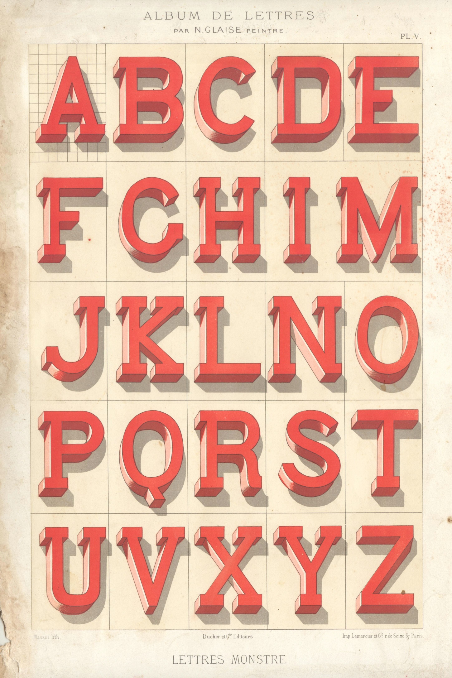
I found this image in an old french book of lettres. I was wondering if it could be desaturated and made into a font somehow. I do not have the resources or the know-how to do this. If you're able to do this and don't mind, I'd be very appreciative if you could send me over the .otf or .ttf file.

Thanks

What is your budget?

I can't imagine this being done for less than mid 5 figures.

I did not realize it was that difficult. Thought someone would've invented a software to plug each letter into or something. I guess it is an extremely unreasonable request. My mistake. I'm fifteen and am very new to the world of typefaces, but I love the intricacy and the aesthetic made through each font. I rescind my request I guess, because I do not have a budget, let alone a 5 figure budget, to work with.

Thought someone would've invented a software to plug each letter into or something.

You could try to tinker with the demo of this:
http://www.fontlab.com/font-converter/scanfont/

The shading and coloring of the sample make it an unlikely subject for a standard font.

But, with a bit of work this kind of look could be achieved by starting with a suitable slab-serif and adding layers and effects in Illustrator.

See also the so-called "chromatic" font systems. A recent example: http://www.myfonts.com/fonts/latinotype/trend/

Thanks for sharing this. As riccard0 says, there are a number of fonts out there with multiple "layers" to create this effect.

It seems that you’re in luck: somebody already did! :)
http://levberry.com/monstre/

Thanks for all of the fantastic feedback! I will check out those URLs and see what I can do.

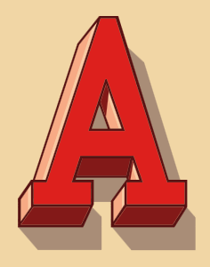
Although not widely supported, you could make a color font. I've made a proof of concept, which only includes the Latin capital letter A.


http://www.high-logic.com/fontcreator/demo/monstre/index.html

It will show the letter in color if you have either:
Internet Explorer running on Windows 8.1; or
Firefox version 32 (on all platforms)

Wow that's awesome! I didn't realize it existed. I saw it in this old french book and didn't realize someone had digitalized it already. Thanks so much.

(Interesting... tracking)

It IS interesting, but even though it's that way in the original, the /A bottom serif shadow as well as the top of the /A is wrong.

[Edit] On second thought, maybe it is right; it just looks so wrong to me.

Captured from web.archive.org on 21 Apr 2015. view this capture