Typophile

Belvedere - What went wrong?

Keith Tricker0 votes

I released this font family on myfonts a couple of weeks ago expecting it might be, if not a runaway success, at least moderately popular. To date, though, not so much as a single sale. Is this just a fashion thing, are we still in the silly season, or is the work seriously flawed? I spent two or three months drawing it, so it's a bit galling that it's met, to date, with total apathy! Your comments, suggestions and critiques are welcome. I attach a small sample, but you can view the full family at: http://www.myfonts.com/fonts/studio-k/belvedere/

When you make a font or family you really hope everything will go well sales-wise, but you should not expect it to happen -- that's kind of like buying a lottery ticket with your last dollar thinking for sure it's going to be a winner. Just because you really, really like a design doesn't mean others will.

Even in the days of foundry type, ATF's biggest worry when introducing a new font in the various sizes was that they might end up with 150 linear feet of type inventory on the shelf that no one wanted.

Don't let non-sales get you down though; keep on making fonts if that's your thing. Just don't depend on font sales supporting your lifestyle because it's not likely to happen.

Thanks for your thoughts George. I know its a bit of a lottery, and I'm not depending on font sales to support my life style (just as well!) Just hoping for a little feedback, and sales are the sincerest form of flattery, to twist a phrase. Anyway, thanks for your encouragement. What do you think of Belvedere, as a matter of interest?

Absolutely, sales are a big motivator. As for Belvedere, it is interesting but I don't see it as being used widely -- but that's just one man's opinion.* There may also be other fonts out there that people already own that are similar -- which will block sales.

I looked at the MyFonts specimens, and I must say it is very tight if that is normal spacing. While that shouldn't matter too much because of today's software capabilities, some people could be deterred by it, particularly if adding letterspacing might cause the spacing to become less than optically pleasing.

*When ITC Souvenir first came out in the 70's, I absolutely loved it and still do. Today though, many people just about detest it. Why? I have no idea because technically it is well done and is pleasing to the eye, at least to me.

Thanks George, that's useful. I think you may be right about the spacing. Generally I like to keep it tight on display fonts, but with this there's probably a case for letting a bit of air in. Perhaps the designer who did some of my graphics (Voodoo Lounge, for example) was trying to tell me something! As for the rest, I console myself that it's a fashion thing and I'm way ahead of my time!

I think there is nothing wrong with this font. But nobody really knows what would sell.
You wrote at the myfonts description that it has Italian roots, could explain this better?
You have several other fonts for sale, this is the only one that got dust on the shelf?

Hi Caparica - The Italian bit is a backwards justification. I just liked the name Belvedere which has Italian roots. The inspiration for the font actually came about when I was drawing an inline for another - Showbiz - although the finished result evolved considerably. Most of my fonts sell well, if not spectacularly. Showbiz, Soft Rock and Alma Mater are particularly strong sellers. Some of my early work like Contessa sells hardly at all, but my skills have developed a lot since then. As you say, there's really no accounting for taste, but if you have any other insights I'd be pleased to hear them.

The core concept is not new and there are a lot of similar typefaces where it is executed better. It has some exotic characteristics which make it very hard to embed it into a design. On big sizes it looks like some letters are longer than others.

It looks nice, but the application seems rather specific and based on what does sell very well on MyFonts, I think perhaps the style is just kind of out of fashion. Clarity seems to sell; typefaces with a much broader application. The more specific your style is, the less sales you can expect, I imagine.

Thanks for your thoughts. On reflection I think Belvedere suffered from being released on My Fonts on the same day as Conto, which is similar in many ways but offered a bigger range of weights in both display and text and at a swingeing discount! As for the general/specific thing I think you can argue that both ways, and I thought Belvedere struck a nice balance between the two - but then I would say that, wouldn't I?

I don't really see how Conto and Belvedere are competing with each other. Belvedere is more of a display type while Conto has a broad text application. Seeing Conto Slab, I realize the typeface is somewhat reminiscent of DTL Prokyon and DTL Antares.

As for the general/specific thing I think you can argue that both ways

I agree. It has to fill a niche though. Although I do think Belvedere is rather unique and as a display face should compliment text typefaces that explore a similar road, perhaps the broader application of those other faces is what's competing with Belvedere. I'm thinking of faces like Uni Sans, Flexo, Core Sans and Helia Core. Still, I do find it puzzling you haven't sold a license considering, as I said, it seems to compliment other typefaces. But I must say, I don't remember having used any spurless typefaces before, so I wouldn't have an immediate need for Belvedere either.

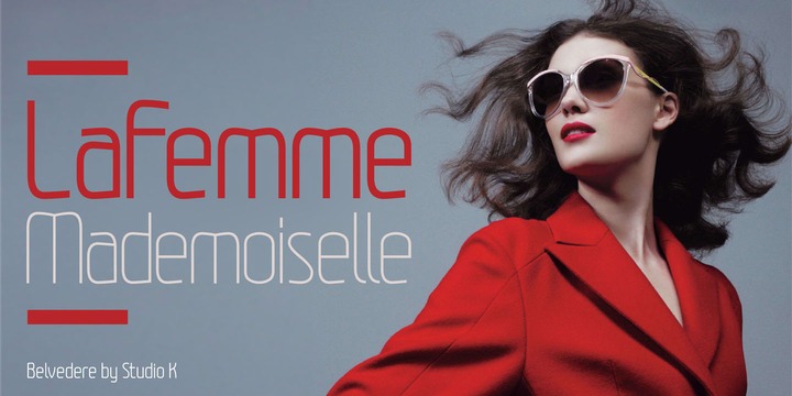
Could it be a matter of marketing strategy? I feel this picture presents the typeface very well: http://cdn.myfonts.net/s/aw/720x360/292/0/149747.jpg

Thanks again, Martin, you insights are helpful. It had occurred to me that marketing might be the problem, and I went so far as to change the graphic during the introductory promotion, although I stuck to a purely typographic presentation. I'll try your suggestion with the 'La Femme' graphic next time Belevedere goes on promotion, and perhaps promote it to front of house in the gallery. Watch this space!

I think Martin may have hit on something - The image with the girl does present your font well. The rest of the images don't present your font well or seem well thought out. I guess I'll be critiqueing your images...

The images with the paisley backgrounds competes with your font too much. The font doesn't really compliment an image/idea/concept or just show off the font well. It competes with the background like another texture.

On the wedding image, it doesn't flow well - looks a bit like a collage - maybe get rid of the hand rail?

On the Alienwear, I think that sends a mixed message, presented where a Sci-Fi font would do well. I don't think the font is suited for both "touch of class" and Sci-Fi. The Alienwear image looks poorly put together too. The design looks like it all should be centered, but the title is off to the left, the "heads" are off to the right, "by Studio K" is way left, while "Belvedere by Studio K" actually is centered. Do you really need "by Studio K" twice in that image?

The other images are somewhat bland.

You don't need "Studio K" and the font name in every image do you? That seems too much. Take a look at the images in "Selfie" for example: http://www.myfonts.com/fonts/argentina-lian-types/selfie/
The font name used only once in all the images, and note too where actual words are used complementing an image/idea/concept.

I agree that the slideshow isn't doing you any favors, and some of the images aren't lending themselves well to the feel of your typeface—the alien slide most obviously. Maybe you could show off all of the weights in one slide (instead of 4) and mock up an advertisement to help prove its use? Good luck! I'm working on my first typeface now and it's like playing whack-a-mole with all of the kinks.

Thanks Special K and Jennastempel. Haven't checked this post out for a couple of months, so sorry not to have replied earlier. I think the presentation is a bit uneven and I take your thoughts on board. I've recently made Belvedere Extra Bold the 'front of house' face on My Fonts and immediately generated some quite healthy sales, so I guess that goes some way to answering my original question - the bolder fonts seem to have more of a resonance with designers. Hopefully sharpening up the images will help some more.

Captured from web.archive.org on 6 Aug 2017. view this capture