
Hello Everyone,
I have been a member of Typophile for a long time now and wanted to promoted my typographic artwork on this forum. Please let me know what you think of it and it's concept.
I design the visible relationship between typeface, landscape and culture (architecture, philosophy, art movements, politics).
Typography is to visual language as maps are to topography.
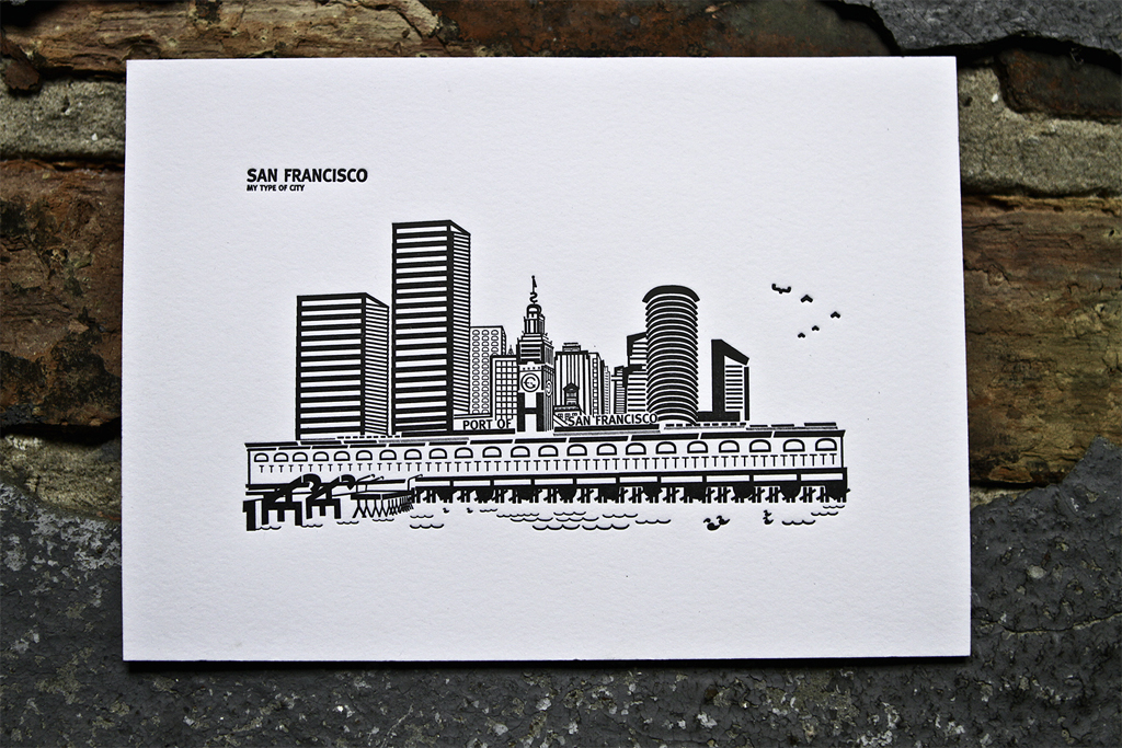
I am a pioneer in the land of topographic typography ( Check my work out https://www.kickstarter.com/projects/omarsandoval/topographic-typography... ). I seek to shed light on typeface design, to generate insight, and to delight by setting my favorite cities in a face whose historical echoes and associations that harmonize with the forms they belong to. I paint by numbers, letter forms, and a palette of analphabetic symbols that have the same character, spirit and personality of each location.
Topography: originated in ancient Greece as the description of a place (topos, "place" and graphia,"writing"). This meaning is less common in America where it is synonymous with relief and elevation contour drawings. (Wikipedia)
Typography: also originated in Greece (typos, "form" and graphia, "writing").
Historical Interlude.
Typographic history mirrors topography such that it is the study of the relationships of human culture: politics, philosophy (structuralism, post-structuralism), architecture, and art movements (Renaissance, Baroque, Neoclassical, Romanticism, Realism, Geometric Modernism, Lyrical Modernism and Post Modernism).
I believe Typography is architecture on a page; typefaces are buildings, leading floors, columns walls, tracking rooms, kerning furniture, letter forms bricks and the grid mortar.