
Does anybody know what serif font is being used in this logo?
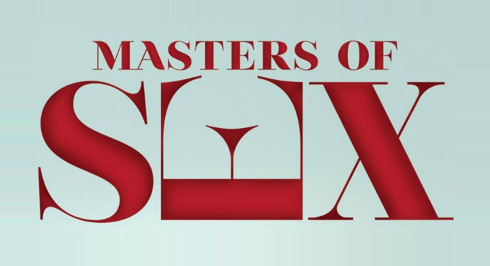
Does anybody know what serif font is being used in this logo?
Best match I could find is Encorpada (the M, A, and R would need to be customized):
http://www.myfonts.com/fonts/dootype/encorpada-pro/

_MASTERS OF SEX_ is a fairly close match to the similarly named "Lust" https://www.myfonts.com/fonts/positype/lust/ _R_ seems pretty well spot on. Use the leg from _R_ for the strokes on _M_ and _A_. Use the Didone version of Lust.
I suspect that _MASTERS OF SEX_ is not a specific font as such, but rather is yet another attempt to make a sexy set of Didone letters.
Don
I spoke to soon. It appears to be an adaptation of a free font called Nouvelle Vague by Dirk Schuster:
http://www.dafont.com/nouvelle-vague.font?text=MASTERS+OF+SEX&psize=l
http://www.bropix.de/index.php?/graphic/nouvelle-vague-font/
Good find Kevin. So this attempt to make a sexy set of Didone letters actually resulted in a font. A student project that made it into the commercial world.
Don
Let's hope they paid for a commercial use of the font, or at least gave Dirk credit. There's talk that they ripped off the overturned E from another designer....
Captured from web.archive.org on 24 Nov 2014. view this capture