
http://www.amazon.co.uk/Sounds-Interesting-Observations-English-Phonetics/
Font:
Formata Pro
Solved By:
http://www.amazon.co.uk/Sounds-Interesting-Observations-English-Phonetics/

EDITED
You really have no idea how rude you come across, do you?
http://typophile.com/node/119254
Zooming in only makes the sample larger and fuzzier. Despite that, I do think I have identified it:
http://www.myfonts.com/search/Formata/fonts/
I will be more careful to read who the poster is in the future....
Thank you, everyone!
Can't you zoom in, kthomps5?
It doesn't appear to be Secca, but it looks similar.

It seems I really don’t have anything better to do… ;-)
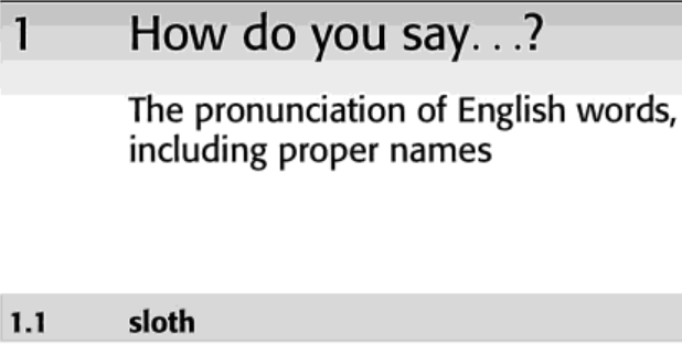
Thanks, Riccardo, but I already located a higher-res version of the book interior (see ID above):

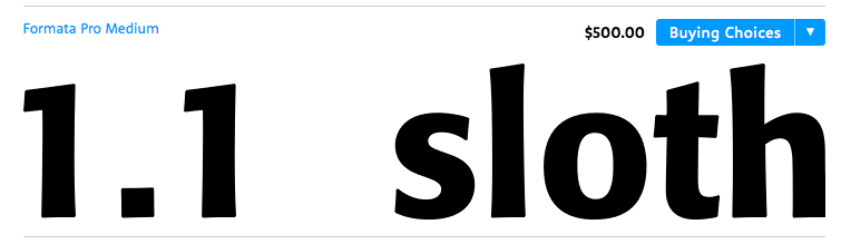
kthomps5, I think you were projecting your prior hostile impression you had of me, and when I said Can't you zoom in, you thought that it was said in an evil and commanding tone.
In reality, it was an expression of being surprised that you haven't.
It doesn't appear fuzzy. Look how nice it looks in riccard0's screenshot! So clear.
It was so very evil of you to link to a thread illustrating my apparent rudeness. If you were so polite, why did you do it? How beautiful. It is so intriguing when these things happen.
Thank you so much!
Thanks, Riccardo, but I already located a higher-res version of the book interior (see ID above):
No, you haven't. Where is it?
Sylph, Riccardo's screen shot is still very low-res and full of halo artifacts—not sufficient resolution to successfully run through visual recognition software. I sought out another reference sample of the book, and ran that to get a match.
Just compare it to my screen caps of Formata to see the difference.
And, no, I'm not projecting anything. Your written communication could stand to be less terse—I'm not the only person who finds it rude.
Captured from web.archive.org on 17 Mar 2015. view this capture
Link not working for me.
Don