
Typophile

Similar to FF Bau and Arial

Heyman Smulders

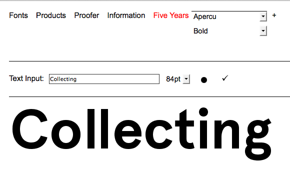
What stands out is de double story 'g' and the round dots above the 'i' and the descender of the 'y' doesn't have a curve.

Here's a link to see FF Bau:
http://www.fontshop.com/fonts/downloads/fontfont/ff_bau_web_medium/web_t...

Thank you for helping!

Font: 
Apercu Bold
Solved By: 
Not Brown or Circular, by Lineto.

I'm sure we've discussed this double-story g with the square ear before, but I can't remember its name....

Heyman, is this from a print publication, or museum signage?

The more details you can provide, the better we can narrow down the foundry.

Productus from Font Bureau has a similar g and i, but isn't right for the rest of the alphabet....
http://www.fontbureau.com/fonts/sans/Productus/styles/

Kevin, thank you so much for your question.
It's a publication from Unseen. This is the website:
http://www.unseenamsterdam.com/tags/magazine

I notice the same font is used on the website and I simply used the browsers 'inspect element' to find the font
Apercu Bold

http://fontdeck.com/font/apercu/bold

Ow and all the others, thanks for your efforts, it's really appreciated!

FOUND IT

Apercu, by Colophon:
http://www.colophon-foundry.org/proofer

How dit you found it so fast not even knowing the website, and the source of the publication?

I knew it had to be one of the new, "trendy" sans serifs, and if it wasn't Lineto's Brown or Circular, I could still find it here:

www.fontsinuse.com

Thank goodness its name started with an "a"....

haha, well thank you for your help!
And that website is one to bookmark!
Cheers Heyman

Captured from web.archive.org on 17 Mar 2015. view this capture