Typophile

Old-style numerals—even in modernist and sans text?

Jchthys

I’m finally reading The Elements of Typographic Style. In §3.2.1, the author says that text figures should always be used outside of full-caps environments.

To me, this makes complete sense for typeface styles in the eighteenth century and before, as well as for many modern revival typefaces. I was wondering if there is any disagreement with this piece of advice for particular styles of typefaces. I’m thinking of Modern faces (like Didot), some Transitional faces (Baskerville) and especially certain sans faces. It seems wrong to foist the typographic convention of non-lining figures, long-standing as it is, onto modern styles of type for which geometric rationality is paramount.

(In a similar vein, type designers’ penchant for adding quaint ligatures to sans type seems, well, a bit odd.)

Has anyone else thought about or discussed this issue?

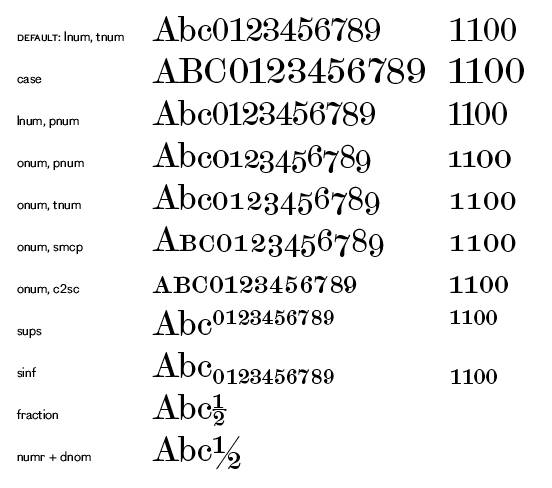
Since the introduction of OpenType, and in particular Adobe applications’ OpenType menus, I have been including both lining and oldstyle figures in all my (text) typefaces, irrespective of genre. I don’t want it to look like there is anything missing. e.g. Scotch Modern:

Then it is up to the typographer to choose which style is most appropriate.
However, I do tend to make the default figure style correspond with the traditional style for the genre.

To me, it has more to do with maintaining the flow of the typeset line than with any historical tradition.

"Old Style?" "Quaint?" Perhaps. But non-aligning numerals and yes, some ligatures, actually help maintain the visual flow and unity of a line of type, aiding readability. When they are badly or indifferently applied to sans serif typefaces, they can be downright distracting—even awful. But they don't have to be if well and thoughtfully done.

As for "geometric rationality" being paramount in modern type design—hogwash. That may have been the impetus for people like Paul Renner, Edward Johnston and others creating early geometric sans faces, but we entered the post-modern era of type design long, long ago.

The Bauhaus is dead, long live the Bauhaus—or any other bygone era these days.

Given that the first sans serif typeface dates from the first half of the 19th century, not the 20th, what is "historically" appropriate as it pertains to them? If a typeface fulfills both form and function, I'm a fan.

I know that classic typewriter typefaces used semi-old style numbers (like Georgia, the numeral 1 was like lining numbers rather than like a small capital I) except that the degree to which the numbers went above or below the line was so small, they were treated like ranging numbers.

A typeface like Futura, for example, probably would not look bad with oldstyle numerals, since Futura's width proportions, among other things, are similar to those of old style faces rather than modern faces.

Personally, I'm not a fan of oldstyle numerals, but it's not a question of authenticity for me; they cause the same problems in Garamond, where they are the normal form associated with the typeface, as they would for Times Roman. So if someone prefers oldstyle numerals, I would concede that one the same freedom I want for myself.

“As for ‘geometric rationality’ being paramount in modern type design—hogwash.”

Sorry, I meant that as referring to particular Modern-with-a-capital-M typefaces—not intending to cover any contemporary typefaces which may look beautiful with “old-style” figures.

But just as it’s strange to give Renaissance faces bold italic fonts and lining numerals, it seems strange to insist on “old-style” numerals for certain other kinds of faces.

I know that classic typewriter typefaces used semi-old style numbers (like Georgia, the numeral 1 was like lining numbers rather than like a small capital I)

A number of classic typewriter /1/s were like the letter /l/s, because that's what they were!

Jchthys, my point was that if a designer only adds non-aligning figures and ligatures to a contemporary sans serif typeface because he or she thinks they have to be there—and executes them poorly—the results can be jarring.

If a designer doesn't want to add them, then he or she shouldn't.

But unless the lining numerals are exquisitely designed and sized to flow with the rest of the alphabet I'd hesitate to use that particular typeface to set long stretches of body copy. Setting up and applying character styles to all the instances of numbers (to reduce their size slightly so they don't stick out like sore thumbs) in a long text is much more laborious than selecting non-aligning figures. And the results are less visually pleasing, in my opinion.

And if the letter forms are designed in such a way that the curve of the f never abuts with the dot of the i or another f or an l (just to name one ligature pairing), then they aren't necessary. But if those and other character pairings do crowd one another, then ligatures should be offered—regardless of whether the typeface is a classical revival or Modern with a capital M.

kthomps5, that all makes sense.

The ligature family I’m particularly referring to is the ‘quaint’ ct etc. I see these in many specimens for new sans faces, where these ligatures really serve no purpose, either for historical/traditional or for stylistic reasons. (Here’s an example—not that I want to pick on exljbris particularly, as I am a fan of Calluna. I see this kind of specimen often.)

In §3.2.1, the author says that text figures should always be used outside of full-caps environments.

I question most anyone's pronouncements about what should and shouldn't be done when it comes to issues that are largely matters of aesthetics. Text figures have their place, as do lining figures. There might be a few rules of thumb, but hard and fast rules are made to be broken. For me, it's mostly a matter of what seems appropriate when considering the specifics of the situation at hand.

Regarding Elements of Typographic Style, here’s a dissenting view:

https://medium.com/re-form/a-refutation-of-the-elements-of-typographic-s...

EDITED:

Jchthys, some type designers are a bit like some architects—sometimes they just can't help over-designing things. If they like those sorts of ligatures, unfortunately there is little we can do to stop them from including them in their glyph sets—if we don't like them, we don't have to use them.

Mark, thanks for the link. Bringhurst's The Elements of Typographic Style is approaching the 25-year mark in a few years, and maybe it's time to revisit its "rules"—especially since they date from the early years of digital type design, and are heavily rooted in the conventions of the moveable type and phototypesetting eras.

I still encounter clients who refuse to let me use non-aligning figures in running text ("What are those weird numbers?"), who balk at combining sans serif and serif faces in a design ("Isn't there a rule against that?"), and who think ligatures are a misprint.

At least Bringurst gives me some backup on the major issues.

I like these two better:

Design with Type, by Carl Dair

Thinking with Type, by Ellen Lupton

The first one is a classic, the second is more current.

Also: At the risk of coming off as a pedant, I think you mean type designers, not typographers.

there is little we can do to stop them from including them in their glyph sets—short of refusing to use their fonts.

You can always make fun of them.

Points taken, Mark and Frode.

Now, I have to go make fun of some architects....

Captured from web.archive.org on 6 Apr 2015. view this capture