Typophile

What's·The·Real·Robert·Granjon·Roman?

Stefan Miklos


¶ Apart from the notorious Claude Garamont and his Garamond typeface, Lyon-born Robert Granjon, another key figure of the French Renaissance, gave us roman and italic typefaces.

¶ The question that comes to mind now is what's the real Robert Granjon "roman" available on digital format:

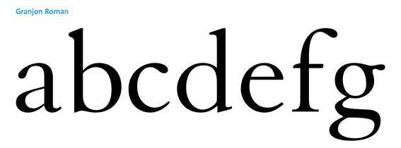
Granjon (George William Jones)
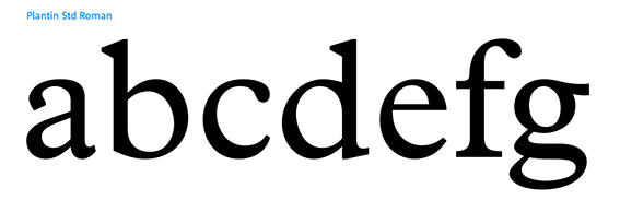
Plantin (Frank Pierpont)
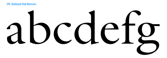
Galliard (Matthew Carter)
Other…

¶ Many thanks to your inputs to come.

Since Granjon produced nearly 2 faces a year, out of his c. 20 Romans which would you consider as »the« Granjon-Roman? Not sure if someone can name »the real Granjon« unless all of Granjon's faces are available digitally?


¶ Find three different designs. The last two typefaces are officially based on Granjon's romans.

Granjon (George William Jones)

Plantin (Frank Pierpont)
"Based on overinked proofs taken from worn types of one of Granjon’s late romans surviving at the Plantin Museum, as interpreted in 1913 by Pierpont and the Monotype Corporation drawing office."

Galliard (Matthew Carter)
"Galliard was originally designed for Mergenthaler Linotype in 1978 as a photocomposition typeface. It is modeled on the work of Robert Granjon, a sixteenth-century punchcutter whose typefaces are renowned for their beauty and legibility."

Starting with the lowercase a, Galliard is obviously more calligraphic in nature than the other two typefaces shown, and yet they are all interpretations of the same original?


¶ About·Galliard

"According to Alexander Lawson, 'The name Galliard stems from Granjon's own term for an 8-point font he cut about 1570. It undoubtedly refers to the style of the face, for the galliard was a lively dance of the period.' "

"Galliard has robust strokes and sharp details. According to Lawson, 'While the designers of the regenerated Garamonds were attempting to bring fidelity in their copies, Carter preferred simply to bring to Galliard his interpretation of the spirit of a Granjon original. . . . Galliard thus possesses the authentic sparkle that is lacking in the current Garamonds.' "

How was Garamont "notorious"? Inquiring minds want to know! :-)

hhp

I still don't see how he was notorious though. Is it merely the fact that he sold his typefaces to others?

Also, this has nothing to do with this thread, but I've been wondering for a while now why you insist on using the pilcrow in your posts and why you consistently use it incorrectly.

I guess he is “notorious” because the origin of the Garamonds we have are not his creation, but Jannon’s...?

I'm completely confused by this thread. I see no reference to 'notorious' until Hrant mentions it? And GrubStreet, 'the origin of the Garamonds we have', the origins are crystal clear (printed examples) hence we have: Adobe Garamond, Garamond Premier, Stemple, et al., whats left to wonder at?

Fournier (Stefan) had used this word in his original post. I assume that this is a language issue, and that he misused ‘notorious’ for ‘of note’, ‘well-known’; i.e. Garamond’s name is famous, Jannon’s not so much.

I don't know where the original "notorious" went; I assume it was edited out because it was realized to be a mischaracterization (probably unintentionally so).

Garamont was not notorious. Griffo and Gill were.

About the pilcrow: to me a bit of –arguable– incorrectness is worth it to get that wonderful symbol back in use. I use it on my –otherwise generally quite tiresome– site (mostly for compactness). See: http://themicrofoundry.com/s_nonlatin.html

hhp

Garamont was not notorious. Griffo and Gill were.

Could you elaborate or point me to some sources to read up on this? When it comes to Gill I suspect I know what you mean but I would like to verify.

I use it on my –otherwise generally quite tiresome– site

But Hrant, you do at least use the pilcrow what it's meant for. If you're going to add a line break you don't need a pilcrow. It's one or the other, not both. I guess I'm a bit too concerned with original intentions of the characters. I've always had mixed feelings about Fournier's use of the pilcrow in comments, as it seems to be a gimmick, but I must admit I love seeing the pilcrow and the way he used it in his original post is — now that I've re-evaluated it — the first time I see it adding to the functionality, as the pilcrows denote that the list of typefaces belongs to the second paragraph and is not a new paragraph as might be implied to some extent by using the line break.

Hrant, why don't you update your website though? The 90s look aside, shame on you for using hyphens where you should be using dashes. Don't take this too seriously.

Francesco Griffo's "last appearance in the historical record", according to Wikipedia, was being charged with the murder of his son-in-law, bludgeoned "to death with an iron bar".

Griffo: Yes, and he was hanged for it. But some people say he was framed.
Gill: Sex with daughter and animals (note: AFAIK not at the same time). Working on high scaffolding in a smock and no underware.

Pilcrow: Well, originally originally it was a place-holder for a missing illuminated initial letter in cheaper versions of books. And FWIW to me Stefan has the best-looking posts on Typophile.

Update my website: Do you go vandalizing museum exhibits?!

hhp

Interesting fact about Griffo. As for Gill, I suspected you were referring to the incest, though I had no idea he had sex with animals.

And to me Stefan has the best-looking posts on Typophile.

Why aren't you using the pilcrow in the same fashion? Laziness or do you feel he has a monopoly on it?

Update my website: Do you go vandalizing museum exhibits?!

Vandalizing, no. I do however tend to have criticism.

Using pilcrows on Typophile myself: not that Stefan has a monopoly, but I've never been one to copy style (without giving credit, which would be too hard here). Example: Jeans? I don't own any. Because they don't feel good (and I don't care how they look [on me]). I much prefer corduroy (even in the 21st century).

My site: No, you're right. The only good thing about it is its horizontality.

hhp

not that Stefan has a monopoly, but I've never been one to copy style

That's what I was implying by a monopoly. He's the only one, or perhaps just the first one who started using the pilcrow within the context of a forum. In a way it's his invention. Copying him probably couldn't be taken seriously, until we all do it and then it's just convention.

My site: No, you're right. The only good thing about it is its horizontality.

I wouldn't mind updating things a bit for you, free of charge. Just some refreshing colors and typography (of the body text) would make a huge difference.

Well that's a very kind offer! I would only consider some sort of barter though.

hhp

That's fine. Whatever you want to give in exchange. I assume you do have an offline version for me? Just zip it and send it to msilvertant@gmail.com and I will see what I can do.

OK, great – when the time comes! Thanks.

BTW, you're not complaining about Stefan's use of midpoints instead of wordspaces? :-)

hhp

I don't see what I don't know. Where do I see these midpoints?

In the subject of this thread. Sorry I've made you aware. :-)

hhp

That's odd… I'm fairly certain I've seen them and yet they didn't quite register. Now that they have registered, I object to it. What was the purpose there?

What was the purpose there?

Imitating Roman inscriptions.

With lowercase letters? I don't like it.

Ah, the midpoints are those little dots, like British decimal points. Not some design feature.

I was going to say that lower-case letters had serifs, in imitation of the capital letters in Roman inscriptions, because they ought to harmonize visually with capital letters... even though they originated from something so different. I suppose we could have stuck with Carolingian script as the central point of origin for mixed-case texts, using Roman capitals as a basis only for all-caps typefaces...

but the temptation to use the prettiest-looking historical model as frequently as possible was too much to resist.

A world in which nearly all (Latin alphabet) text typefaces are highly calligraphic, and Roman types are a specialty item - like Copperplate Gothic, or Trajanus, all-caps only. That's hard to even imagine. Presumably it would be a world where historical authenticity overrides other values - or one where the activity of typography is stunted by economic constraints. Be that as it may, alternate choices - including the opposite, a world where typography is less bounded by tradition - are useful sources of new ideas.

As one trivial example... imagine a world where typefaces aren't classified by their serifs. Serif versus sans-serif would still be a significant distinction, but, for example, hairline serifs wouldn't imply that the rest of the letterform follows Bodoni and Scotch Roman - hairline serifs or wedge serifs (fonts like Latin Bold) could be stuck on an old style body just as easily, and so the other features of the letter like the degree of stroke contrast would be the classifiers.

For historical reasons, the mainstream of type development has been in a very narrow subset of the possible design space. Hermann Zapf's famed Optima stands almost alone as a foray outside that zone suitable for text, rather than just display, use.

Captured from web.archive.org on 17 Apr 2015. view this capture