Typophile

The assumption that logotypes are born, fully-formed, from typefaces

K.C. Thompson

I've spent a good deal of time on this site over the past few months, focused mostly on helping people identify typefaces on the Font ID forum and on broadening my own knowledge of the current type landscape.

While I understand that non-designers may wrongfully assume that logotypes are born, fully-formed, from a typeface, I seem to be encountering a growing number design students and young designers who assume the same.

I did not go to art school, and I've only guest-lectured to design students a handful of times over the past twenty-five years. So my question to those of you who do interact with students more often—either as full-time faculty or as frequent guest lecturers—is this:

Do you think that today's design students are being taught to actually create, or has the explosion and abundance of online resources resulted in a climate where they simply find a "cool" typeface and use it literally or virtually unaltered?

Your thoughts would be appreciated....

I gave a talk to some 3rd year graphic design students about type and logo design. They had virtually no knowledge about anything type-related, and I wondered to myself what exactly it was they were learning, as type is the cornerstone of graphic design. After the talk I set them an exercise to draw a word to see what sort of designs they could produce. The results were truly appalling: not one of them showed even the slightest competence in handling a pencil, looking like it was the first time they'd ever used one. A group of ten year olds could have done better. I showed them some of my stuff,
http://www.g-type.com/portfolio
And they were asking what fonts I'd used, or what the designs were based upon. They couldn't really grasp that I was capable of creating designs from scratch. I was shocked by the experience, and saddened to think that none of them have any chance of getting a job when they leave.

Nick, thanks for your response.

I'm trained as a painter and printmaker, so I've always drawn and hand-lettered. Add to that the fact that desktop computers really didn't begin to take over design until I was halfway through college, and you've got someone who straddles the divide between analog and digital.

If you start with the computer and are never encouraged to use any other tools, I think it limits your creativity.

I think you're probably right there. I too started in the olden days BPC. You do actually need to be able to draw before you can draw with Béziers.

In my experience teaching, students do cover typography as a basic, but it is early on in their course, and there is so much other stuff—web, interactive, animation, etc.—that it doesn’t hold the position it once did.

Also, the nature of typography has changed.
It used to be about choosing a typeface and how it is spaced, but that is not so important in dynamic-content media that doesn’t “set” type, and in applications that involve timelines.

Agree with Nick's comment.

Before desktop publishing most design school taught how to draw fonts, which you needed at least for mockup purposes. Less emphasis on it these days.

I think there's more emphasis on the graphic symbol. Clients sometimes view a purely typographic logo as a lazy solution — "I'm paying you $$ for 10 minutes work to set the name in a font?". Of course a typographic solution is perfect in many situations, but it can be a hard sell to less sophisticated clients.

Unfortunately there are companies that offer pre-made or incredibly cheap logos. Sometimes the designers are from countries where a few bucks goes further than it does here.

It skips the real work of designing a logo — meeting with the client, discussing goals and perceptions, analyzing their competition, going through rounds of revisions, preparing an identity manual, and so forth.

As I commented on another post a couple of weeks ago, used to I teach a book design class. I was teaching people to be graphic designers, not type designers, so I wasn't teaching typography per se, but I told my students that if you expect people to pay you to select type for them, you have to be able to do more than look at a list and say "Papyrus looks cool, I think I'll use that," because your client/employer can do that for herself.
To help my students learn the factors that distinguish one face from another, and make one face more suitable than another for a specific purpose (weight, contrast, x-height, etc.), I had them draw a layout and render the display type by hand. "No one will ever pay you to do this, ever," I told them, "but I'm making you do this because I can show you slides and talk about bracketing all night, but it won't teach you half as much as if draw a word in Palatino and then draw the same word in Century."

duplicate

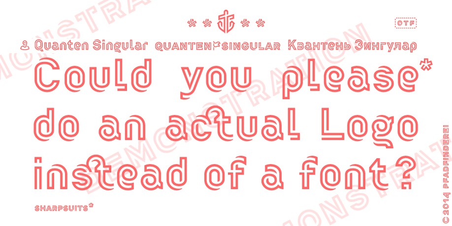
Promotional piece for Gestalten’s Quanten (http://fonts.gestalten.com/featured/quanten.html):


Which, oddly enough, reminds me of Bold Monday’s logo (http://www.boldmonday.com)...

Captured from web.archive.org on 17 Mar 2015. view this capture