
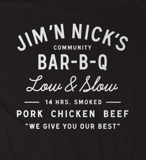
Can anbody ID the typeface used for JIM'N NICK's BAR-B-Q? I am completely stumped on this one so any help would be greatly appreciated!
Font:
URW - SignalNo3DOT.otf
Solved By:
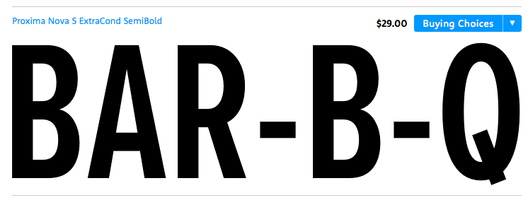
Proxima Nova Semibold Extra Condensed, by Mark Simonson, comes close, but isn't quite right:
http://www.myfonts.com/fonts/marksimonson/proxima-nova/
Low & Slow is Learning Curve:
http://www.bvfonts.com/fonts/details.php?id=76
Thanks for the fast response! Proxima Nova Semibold Extra Condensed is very, very close but not exactly the same. The font used for JIM'N NICK'S has consistent line width while Proxima Nova Semibold Extra Condensed is slightly variable. The R crossbar is also lower on the glyph, just a tad higher than the A crossbar. The Q is also a bit more square in the logo. I have to say, this is quite a bit closer than what I have found so far though. any more guesses are welcomed for sure!
Learning Curve is spot on!
I think the third font (smaller text) belongs to the URW Signal family
Signal, with a customized tail on the Q, comes closer:
http://www.fontshop.com/fonts/family/signal/All/All/Bestsellers/2
I'm going to check out Google fonts—I've a sneaking suspicion it might be one of them....
Mission Gothic Bold (LostType) was a decent match to "PORK CHICKEN BEEF," but not a match to anything else. And I had no luck with Google fonts.
Signal seems to be your best bet for all the sans-serif type, with just a customization on the tail of the Q.
Awesome, Thank you so, so, much for all of your help! I think this is as close as it gets.
Captured from web.archive.org on 17 Mar 2015. view this capture