
I've got a sure-fire stump-er, here. I'm not concerned about the top font. It's Avant Garde. I'm interested in identifying the pseudo-Russian/faux Cyrillic typeface. It's got to be phototype.
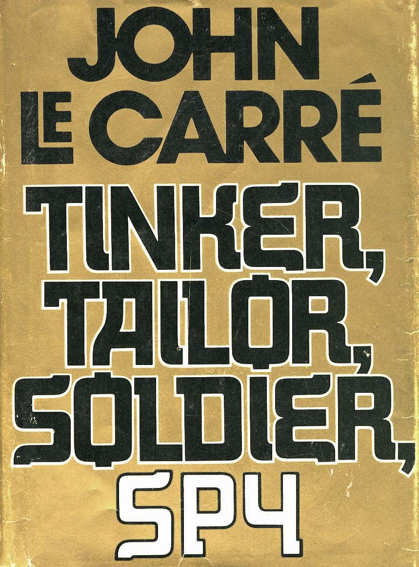
I've got a sure-fire stump-er, here. I'm not concerned about the top font. It's Avant Garde. I'm interested in identifying the pseudo-Russian/faux Cyrillic typeface. It's got to be phototype.

Given the fit of the letter forms, I'm betting this is custom.
Some typefaces with a similar vibe are Stenberg and Rodchenko:
http://www.myfonts.com/search/Stenberg/fonts/

The key to this lettering is the "gaspipe" or "stovepipe" corners. Start with a font with about the right height to width ratio and similar weight that has fairly tight curves outside AND inside, such as Ryoichi Tsunekawa's Design System A 700


Very helpful reply, donshottype. Design System A 700 has some pretty astounding similarities.
The sample could be custom. I should do a little more research about its designer and such. When I saw this thing at a book store, it threw me for a loop. Thanks for the help!
So all we have to figure out is who was designing books for Alfred A. Knopf in 1974....
I checked the credits for a designer. Everything before the 00's leaves out packaging design credits!

The first British edition does, indeed, have a radically different cover (photo by Jerry Harpur), discussed here:
http://www.existentialennui.com/2010/09/new-arrival-tinker-tailor-soldie...
Ralphsmouse, I always thought it criminal that book designers rarely got credit for their work in this era. The tide only began to turn in the 80s and 90s....
I looked around and guys like Paul Bacon and Ray Cruz were working for Knopf in the 1970's. The thought of a type designer like Ray Cruz drawing the type in question makes sense. I can't imagine anybody other than a professional lettering artist being responsible for something so inventive and sarcastic.
Rob, after having done this good detective work on Knopf cover designers of the 1970s, you might consider asking Ray Cruz to confirm he did the TTSS cover or, if he did not, to suggest who the designer might have been. If you do find out, it would be interesting to learn the answer.
Don
I’ll ask Ray.
Thanks Stephen.
Don
I mentioned Ryoichi Tsunekawa's Design System A 700 in a previous post and suggested a recipe for using it's corners to make stovepipe elbows to approximate the letters.
Unfortunately the result is very approximate. The curves are too gradual and the weight is too light.
I created my own stovepipe elbows from scratch and constructed these letters and the rest of an alphabet based on my conjecture as to what I thought might work with this concept. I have no idea how the the designer of the Knopf cover would have made the rest of the alphabet. So here is a Tsar Poutine alphabet in use

She's beautiful, Don! You've captured the essence of the original design perfectly!
My thought is that every digital typographer's overall goal should be to give designers the freedom of having options. The more options there are, the more freedom designers have. Something as inventive and idiosyncratic as the original design/Tsar Poutine should definitely have a cushy spot in any designer's tool-shed!
Thank you Rob. If I ever release it as a font the lower case would be a small caps version of the uppercase, just as in Cyrillic fonts, and a real Cyrillic alphabet would be included.
I do hope we find out the name of the book cover designer so that appropriate credit can be given.
Don
I got in contact with Ray Cruz who led me to his coworker at Random House, Lidia Ferrara. She says:
It was designed by Robert Scudellari.
His credit usually read Design by R. D. Scudellari.
I do not have his contact information.
For that you can contact Janet Odgis at Janet Odgis Design.
I love that font, Don! Please release it! It is so unique, and sort of reminds me of the letter style used in some Russian propaganda posters. It's incredible.
Captured from web.archive.org on 17 Oct 2014. view this capture

Good font for a plumber -- all the pipe like shapes.
Nixon had plumbers -- anyone remember Watergate. A US domestic spy story. Presumably Putin has them too,
Would be interesting to see authentic Cyrillic letters in this style.
Don