
I have seen a lot of these, but I can't figure out what fonts have been used. Thanks!
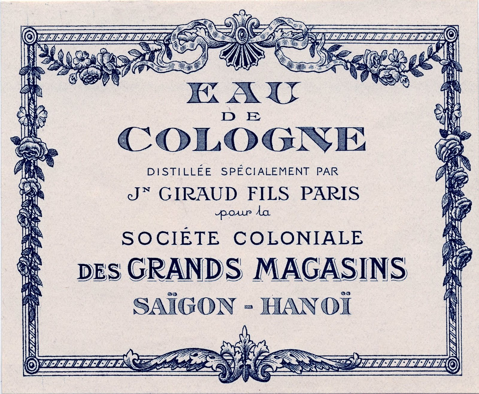
I have seen a lot of these, but I can't figure out what fonts have been used. Thanks!
Are you looking to identify the historical typefaces, or to find contemporary digital fonts that mimic this look?
I'm looking to find digital fonts!
Eau de Cologne and Saigon-Hanoi could be approximated using Chevalier Stripes:
http://www.myfonts.com/fonts/linotype/chevalier-lt/stripes-caps/
More to follow....
Distillée par... could be approximated using Epigraph:
http://www.myfonts.com/fonts/pesic/epigraph/
Societé Coloniale could be approximated using Barcelona (copy the curl from the C and graft it onto the Es and Ls):
http://www.myfonts.com/fonts/itc/barcelona/
pour la could be approximated using Adonis Old Style:
http://www.myfonts.com/fonts/spiecegraphics/adonis-old-style-sg/
You are a serious font detective! Too bad this would all cost me like $300 :(
Des Grands Magasins could be approximated using Horndon, Mexborough, or Bonning:
http://www.myfonts.com/fonts/linotype/horndon/
http://www.myfonts.com/fonts/gatf/mexborough/
http://www.myfonts.com/fonts/gatf/bonning/
Your chances of finding free fonts that match these closely is practically nil.
Search using the keyword "Victorian" on any free font site, but be aware that many of the fonts you'll find are of questionable provenance, and many are only free for personal--not commercial--use.

Kevin has done a good job rounding up what's available in digital format.
About the only part remaining is _DE_. You can match it with Filmotype Royal https://www.myfonts.com/fonts/filmotype/royal/
But you should know that the label is not composed of old time fonts as such. Rather it is hand lettering, probably by using lithography.
For good quality original historic fonts, at no charge you can go through the fonts at http://abfonts.freehostia.com/ go to the authors page. Check in particular Character, Claude Pelletier, Toto.
Don
_Eau Cologne_ and _Saigon-Hanoi_ are not the same design. Note for example the different _N_. For a striped font with the _N_ in _Eau Cologne_, you can use Archive Copperplate Head


To my eye, that style of A should be (more) optically corrected by raising the top a bit higher. Otherwise, it looks undersized - even in Ihlenburg's original.
If you didn't notice, Don, then it's clearly not as glaring as it appears to me. Rather presumptuous of me to be questioning the design of someone like Hermann Ihlenburg, anyway.
Captured from web.archive.org on 19 Feb 2015. view this capture
Right Mike, I didn't notice...
Don