Hi everyone,
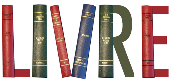
I'm creating a book review blog. I have the name, the logo concept, and the typeface I want to use.
Blog Name: LIVRE (book in french)
Typeface: League Gothic (http://www.fontsquirrel.com/fonts/League-Gothic)
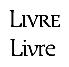
Everything was going well during my design phase until multiple people said at first glance it looks like liver. Definitely not what I want my blog to represent. Toxin gathering organ. So you can tell me if I should continue with what I was doing, change the name (maybe libros) or just scrap the whole thing? I attached my first draft of the logo.
| Attachment | Size |
|---|---|
| LIVRE V1.jpg | 211.3 KB |