
A serif typeface meant for setting long passages of text in. Been working for several weeks on this—I currently have sixteen of the lowercase letters drawn
Please let me know what you think!
A serif typeface meant for setting long passages of text in. Been working for several weeks on this—I currently have sixteen of the lowercase letters drawn
Please let me know what you think!

Minion Pro from Adobe is very close in apperance - I would study it carefully before proceeding.
Hmm. I actually did study the letter proportions of Minion a lot to make this font, but I certainly don't think it resembles it that much. Then again I designed it so the differences probably stick out more to me. Idk you tell me?
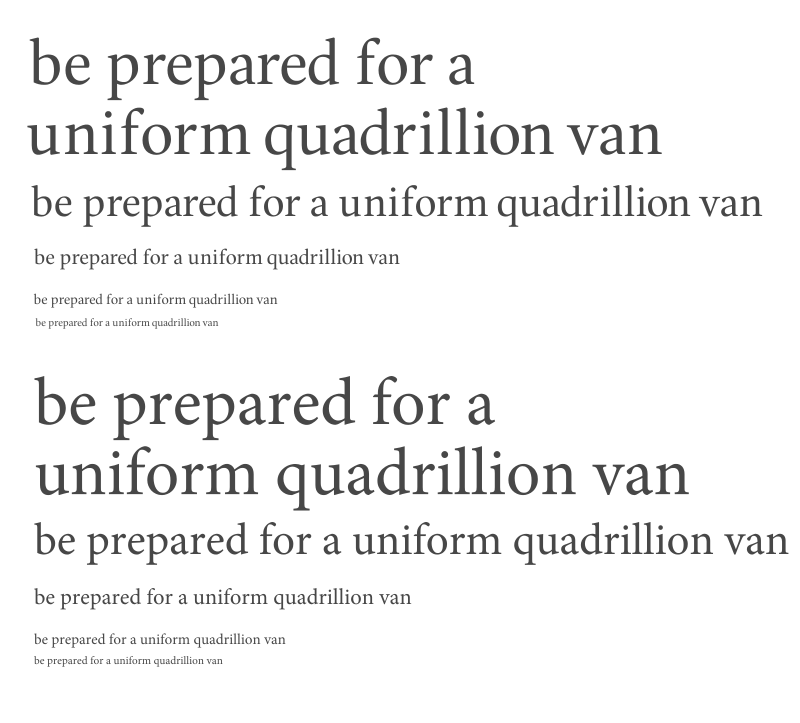
My point was to be aware as you go forward that your font needs to have an apparent difference to have an audience. Using Minion as a model or inspiration is fine - just be aware that making your font differnt enough to not be superficially confused with Minion is important.
Well I tried to make the terminals on the ‘a’ and ‘f’ distinctive and the shoulders of the ‘n’ and ‘m’, but I guess that’s not enough is it...
Also for a similarity search on What the font turns up five similar typefaces, but Minion Pro for some reason isn’t a match, even though it’s in their database. A display style of Slimbach’s Warnock is there thoughh.
I redrew the bowls on the ‘b’ and related letters and made some other tweaks—how does it look now? I like the ‘d’ and ‘q’ now but I’m not sure how well the ‘b’ and ‘p’ go with the ‘e’ and ‘o’ now
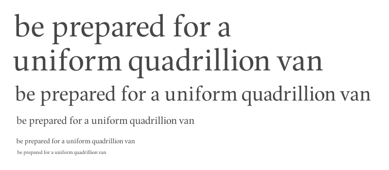
Maybe a "stress" or angle to the e and o, I agree that the d and q benefit from swelling of the counter.
I'm not sure what you mean my stress to the ‘e’ and ‘o’—do you mean they should have more diagonal stress?
Here's another test text with some more changes
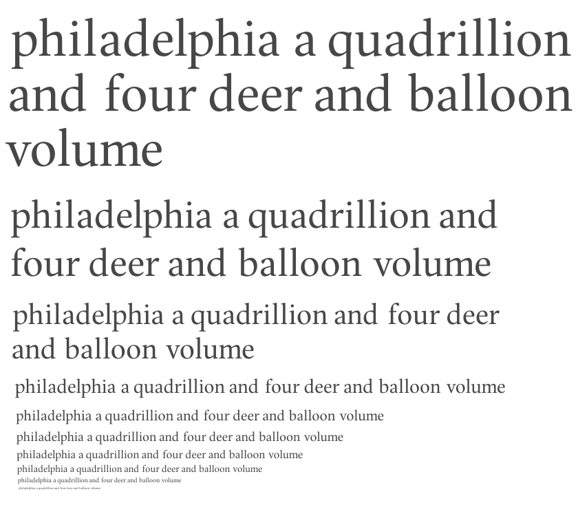
diagonal stress - yes, but carefully
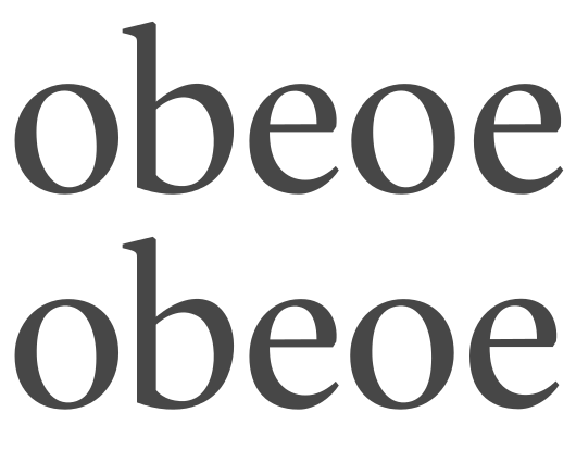
Well I played around with the ‘e’ and the ‘o’ and actually it turns out that what the ‘o’ needed was actually a bit less vertical stress! That's strange but I think it looks slightly better that way...
Old on top, new on the bottom
Captured from web.archive.org on 17 Mar 2015. view this capture
