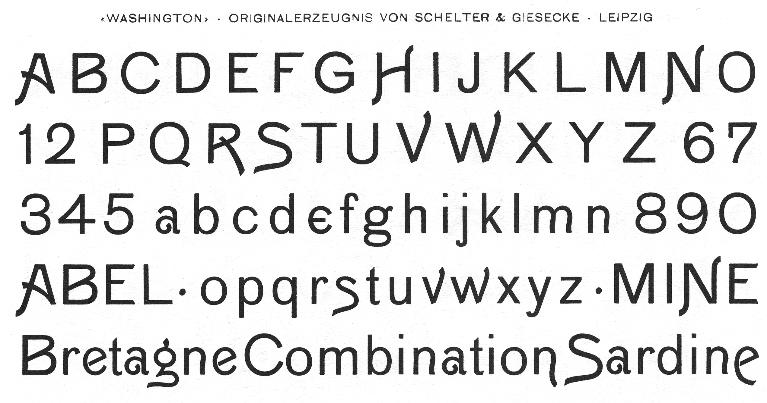
I'm sure we're all bored to tears by now with those 'experimental sans' typefaces that flourished a year or two ago. Essentially they're taking naivist, vaguely Futura-esque geometric lettershapes and adding extra lines, disporportionate character extensions, strange glyph shapes and whatnot for the hell of it. The basic style is clearly still geometric, but the're a bunch of extra crap haphazardly thrown on, negating the original simplifying intent. (This distinguishes it from the actual experimentation Renner was doing with Futura, and from more traditional alternate and swash shapes that tend to emanate from varying the basic ideas of the skeleton itself.)
I thought this affliction was a particular blight on our age, but then while looking for info relating to this thread I came across a set of similarly silly Art Nouveau types: Washington and the two in this comment. Again, it's obviously basically shapes from a particular genre of type (grotesque, in this case) with a bunch of extra, haphazard changes thrown in to make it trendy.
Makes me wonder: Can you think of other examples from other historical periods, that give off a similarly ill-fitting vibe? It's sort of fascinating.