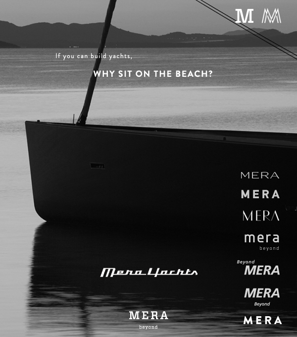
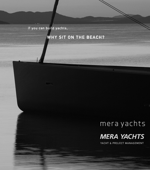
This is one of the logo "sketches" for the yacht project management company (see my previous post).
The client requested one direction to be particularly clean, modern, no gimmicks. Much like http://www.vertu.com/, https://www.flyvictor.com/ or http://www.bang-olufsen.com.
Attached, two superposed versions. How does Frutiger hold up? Knul in small caps looks a bit too playful to me, however it really works here https://www.blackjet.com/
| Attachment | Size |
|---|---|
| Mera.jpg | 159.04 KB |