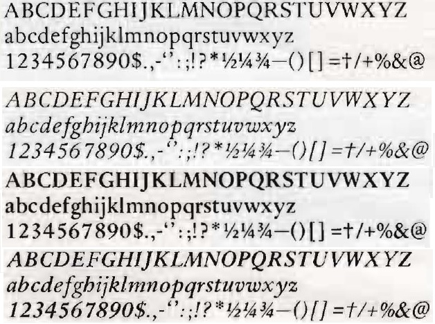
Maybe I'm wrong or cursed by bad taste, but I really like the straight, sword-like italic small f of the original Sabon (I have been looking at it before I knew it was by Jan Tschichold).
I remember there's a post here saying that "the small italic f is the worst glyph ever made." What's wrong with it? Is it so because it is straight? (I guess what Akira Kobayashi has done was correct by changing it back to conventional curly form?)