
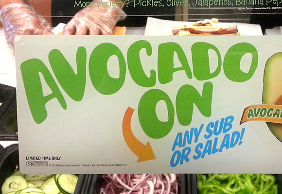
What's the green font? It's at Subway.
hhp
What's the green font? It's at Subway.
hhp

Although some of the repeating letters look close I think it is hand done - but skillfully.
That's what I thought too, but when I looked closer there was too much repetition (obscured by rotation/scaling).
hhp

Since it’s for an one-off promotion, it could well be a collection of just those letters made with a vector program.
Anyway, if someone would like to zoom in for a closer look:
http://www.subway.com/Menu/Promotions/Breakfast/Marquee/W6/Breakfast_Avo...

Meet Me in Brooklyn is strangely close (maybe someone rounded it over for this use?):
http://www.myfonts.com/fonts/street-type/meet-me-in-brooklyn/

Not a close one, but the letter shapes look appropriate for an easy editing: Pusab free font by Ryoichi Tsunekawa [designer at flat-it, Dharma Type, etc]

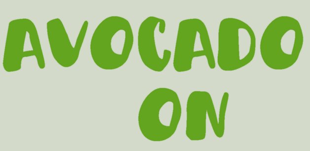
As an experiment I rounded Meet Me in Brooklyn while trying to respect the general average of the outlines
Interesting stuff, guys.
It seems most probable that a setting of "Meet Me in Brooklyn" was somehow processed (maybe an auto-trace of the MyFonts rendering) to arrive at each glyph.
hhp
Captured from web.archive.org on 15 Feb 2015. view this capture