
Fedra Sans Display Pro Heavy is close, but not quite:
http://www.myfonts.com/fonts/typotheque/fedra-sans-display-pro/

Better match is Verdana Bold, though I think on your sample it's been compressed vertically, and maybe a stroke added to beef it up:
http://www.fonts.com/font/microsoft-corporation/verdana/complete-family-...
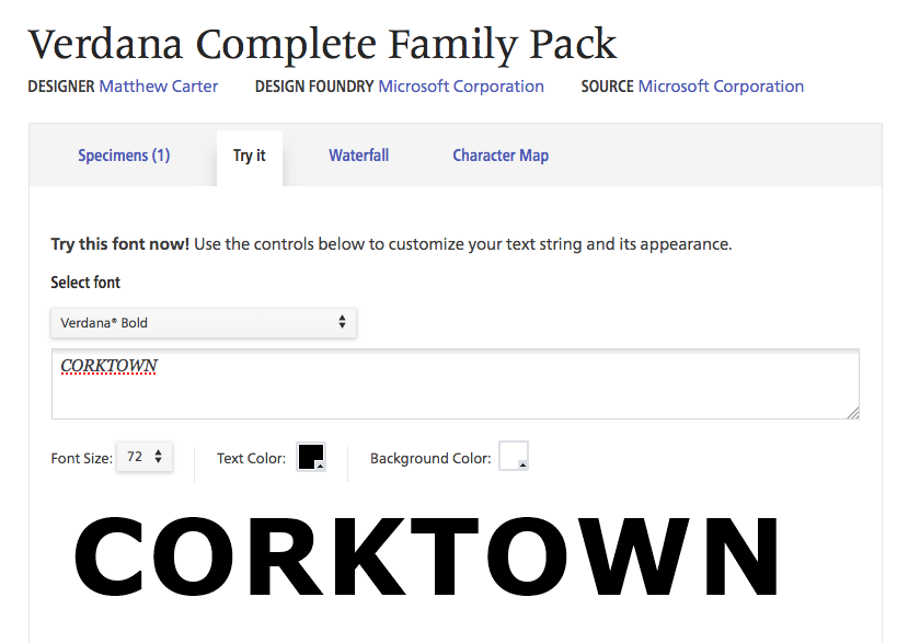

As for Verdana and Tahoma, both are Matthew Carter designs. Tahoma's letters are narrower and it has tighter letter spacing. There is a still narrower version called Nina.
Verdana Pro from Ascender has a Black weight in addition to the Bold. Compare:



Don you UPDATE makes a very interesting point in judging size etc.
Thank you so much for the keen eyes and advice everyone. Very much appreciated!
kthomps5: I think you're correct about the image sample being compressed slightly.
donshottype: Very good advice. I think I will create an intermediate, but will compare with different colours first.
Thanks again all.
Captured from commoncrawl.org on 26 Apr 2015. original URL
