Hey all, so I'm working on updating the identity for a productivity app. The message that needs to be communicated is as follows:
To-do List
Tasks, Notes, Lists, Outlines
Time Management
Productivity
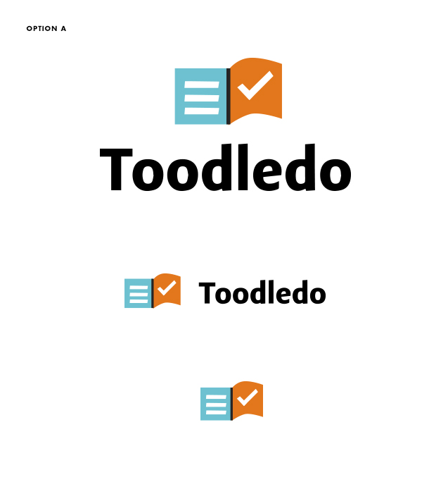
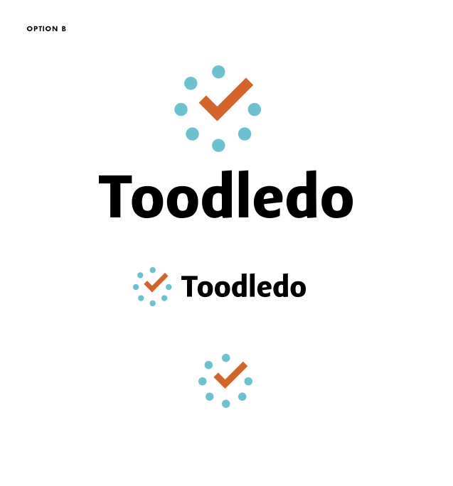
Logo - I've got two logo options I'm choosing between. Both are just concepts so please don't critique kerning, colors or technical tweaks. I need to choose a direction, and it will then be flushed out further. I'm using the typeface Adagio sans for the logo in both cases. I'm leaning towards the page turn as it seems stronger and holds the space better. The dots communicate time management but the mark seems frail to me.
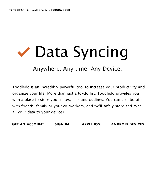
Typography - I'm restricted to using fonts from the standard CSS stack. That said, I'm using Lucida for body copy, and futura bold for CTAs and some headlines. I'd like to stick with Lucida as the users will probably be reading large blocks of copy, so legibility is a high priority. I'm not sure if futura is working with it.
*Please keep in mind this product is also an app, so the mark needs to work well in an app icon (square) shape.