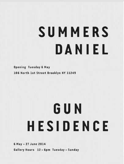
I`m searching for the font in which the capital letters on the poster are written. Pls help -)

It looks like Van Condensed Bold by Ricardo Santos [Vanarchiv, 2004]
Fivos, you beat me to it:
http://www.myfonts.com/fonts/rsantos/van-condensed/
The numbers seem to match as well, though I initially thought the gap in the capital G was too wide....
thanks. I like it a lot
Captured from commoncrawl.org on 18 Apr 2015. original URL