- Image in attachments -
| Attachment | Size |
|---|---|
| Screen Shot 2014-07-28 at 21.57.20.png | 18.41 KB |
| Screen Shot 2014-07-29 at 00.45.56.png | 86.47 KB |
| Screen Shot 2014-07-29 at 00.45.51.png | 47.87 KB |
| Screen Shot 2014-07-29 at 00.44.14.png | 171.49 KB |
- Image in attachments -
| Attachment | Size |
|---|---|
| Screen Shot 2014-07-28 at 21.57.20.png | 18.41 KB |
| Screen Shot 2014-07-29 at 00.45.56.png | 86.47 KB |
| Screen Shot 2014-07-29 at 00.45.51.png | 47.87 KB |
| Screen Shot 2014-07-29 at 00.44.14.png | 171.49 KB |
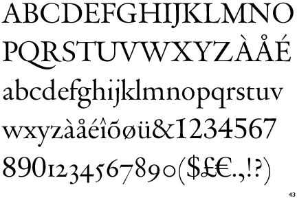
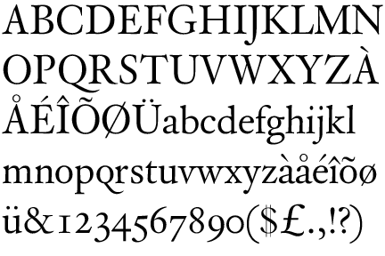
Rongel comes close:
http://www.myfonts.com/fonts/feliciano/rongel/
So does Arbesco
http://www.myfonts.com/fonts/dtptypes/arbesco-dt/
Galliard was my first thought (which is based on Granjon), but I don't see much (if any) upward serif on the top of the T on your sample.
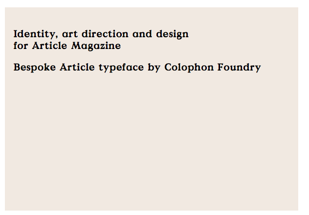
Sure, I have added some more examples in attachment.
Its the typelogo of a very small run "article" magazine, I believe they've only done 3 issues. You can only find their magazines in certain shops.
The mysterious typeface is used throughout their magazine, so I now find it hard to imagine that each title is customised from Galliard.
A few more that are almost there,
DTL VandenKeere by Frank Blokland (1994)


Captured from web.archive.org on 17 Mar 2015. view this capture