Typophile

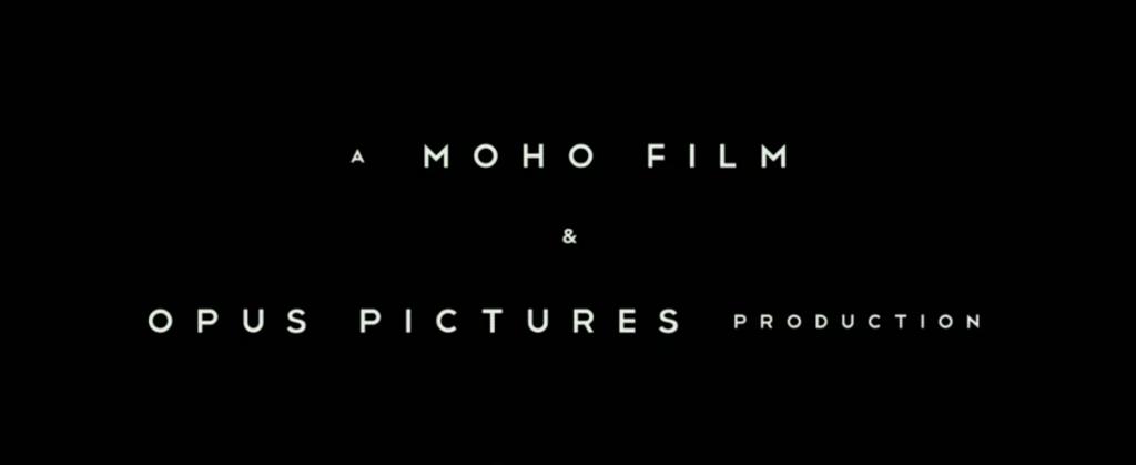
Moho Film & Opus Pictures Production

Stephen Coles

Interesting mix of features from Gotham (uniform widths) and Neutraface (pointed apexes), but obviously neither of those typefaces. Middle bars on ‘E’ and ‘F’ are unusually long.

Font: 
Telegrafico with modifications
Solved By: 

Can't find a match. You're definitely right about these unusually long /E and /F crossbars, can't find anything to match it so may be customized for this feature only? Some alternatives for the moment: Milano MTT, some M-B Creative, CityOf, Arquitecta, Leto Sans

I knew it was remembering something else... If this screen capture comes from Snowpiercer title sequence, here's the previous discussion on the topic. Unfortunately, nobody identified it. My best guess Telegrafico with a custom /S (borrowed elsewhere? Akzidenz-Grotesk?).

Thanks Ryuk. Didn’t know the source of the image. I think you’re right. The hyphen was also from elsewhere as Telegrafico doesn’t have one.

Captured from web.archive.org on 17 Mar 2015. view this capture