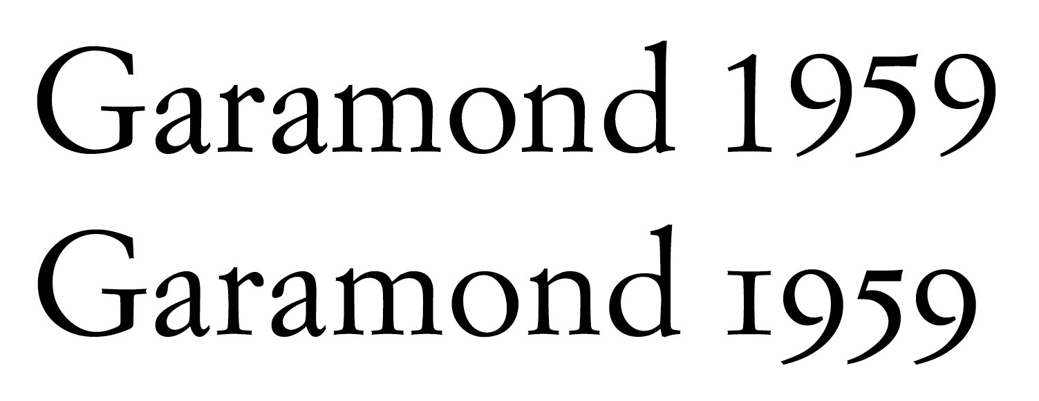
It might help your search to know that this type of "Garamond" is actually a Jannon.
hhp
Einaudi Garamond Pro is the text typeface currently used by Italian publisher Einaudi. Of course, it is a custom typeface, not available to the public. But I really love it!
http://www.einaudi.it/var/einaudi/contenuto/extra/978880621249PCA.pdf
Can you suggest a commercial typeface similar to this jewel? At the moment the only alternative I know is Simoncini Garamond.
Thanks
M.
It might help your search to know that this type of "Garamond" is actually a Jannon.
hhp
hi Hrant!
what is the difference between original Garmond and Jannon.
sb
They were made by different people. :-) The fonts of Jean Jannon were thought to be by Claude Garamont until the 1920s. Which is strange because they're quite different.
hhp
lol, i meant visually.
sb
Oh. :-)
Jannon is more expressive, with a... playfulness that Garamont's work doesn't really have. But to me it's not better.
hhp
Even if I narrow my search to "Jannons", the only similar typeface is Simoncini Garamond... Unfortunately SG is a typeface a bit neglected by Adobe/Linotype: no pro, only three weights, limited kerning...
In fact the usage of Simoncini Garamond (and its many custom versions) as text font is really widespread among Italian book publishers. In Italy it is probably the most successful typeface of the twentieth century, but the only beautiful digital version is, in my opinion, the custom typeface currently used by Einaudi.
true and faux Garamonds – for those who are interested in the differences between them:
Manosk, since you can't license Einaudi Garamond, I guess the best commercial version you can have today is the one by Elsner and Flake (named "Garamond Simoncini EF"), which features the old style numerals - but only in the roman weight, not finely spaced and not even OT-supported - and some of the inktraps which were so typical in the original metal version, and which are slightly noticeable in the quick screenshot comparison I made (top: Adobe, bottom: EF):
https://farm6.staticflickr.com/5565/14714849382_f61a377cb4_o.jpg
By the way, what is curious is that the rights to the original typeface designed for Einaudi in 1961 by Francesco Simoncini and Wilhelm Bilz from Ludwig & Mayer (known as "Garamond Antiqua") are owned today by Neufville.
Since types based on the cuttings of Jean Jannon were called "Garamond" for so long, it's still the case that those are the typefaces ordinary people think of when they think of a Garamond:
[Bad link]
[Bad link]
And here's one example of an "authentic" Garamond:
[Bad link]
Hmm... this is also supposed to be a "real" Garamond:
[Bad link]
unless it isn't the same Stempel Garamond as the books discuss.
Oh dear. I see from here:
[Bad link]
that another group of Garamonds is now to be attributed to someone else, in this case Maître Constantin!
Nicola, actually the last time I checked (a while back, I admit) the ownership of the Simoncini fonts was in dispute between Linotype and Neufville.
hhp
the ownership of the Simoncini fonts was in dispute between Linotype and Neufville.
If I simply look at http://www.myfonts.com/fonts/linotype/simoncini-garamond/ I can read
Publisher: Linotype
Design owner: Bauer Types, S.A.
‘Simoncini Garamond’ is a Trademark of Fundicion Typografica Neufville.
The last line is written at the very bottom of the page, as some form of comment. What does all that mean in terms dollars?
Captured from commoncrawl.org on 28 Apr 2015. original URL