A logo should always work in one colour, and at multiple sizes.
Your choice of fonts is very cartoon like.
The whistle doesn't indicate what game the Geelong Football Umpires' actually umpire.
I would try to incorporate some aspect of the game.
Also your whistle is very cartoonish.
Umpires are professional people who do a serious job.
You need to use cleaner less frivolous fonts, and more stylish adult artwork.
With less 'garish' colours. The cyan you've used is way too loud.
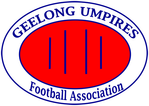
I did a quick search in Google for 'umpire logos'
These were my favourites.


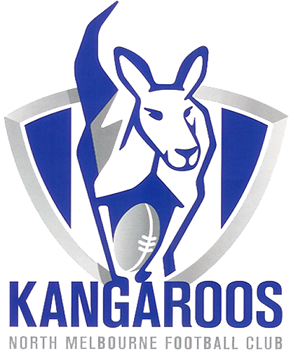
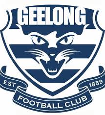
and the football teams themselves seem to use an clean illustrative style, like these.


Perhaps you could develop something along a similar line so it fits in with the games overall branding style.