
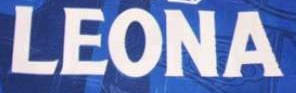
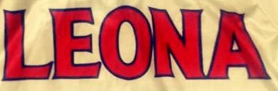
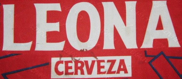
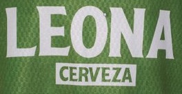
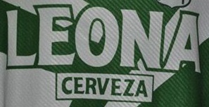
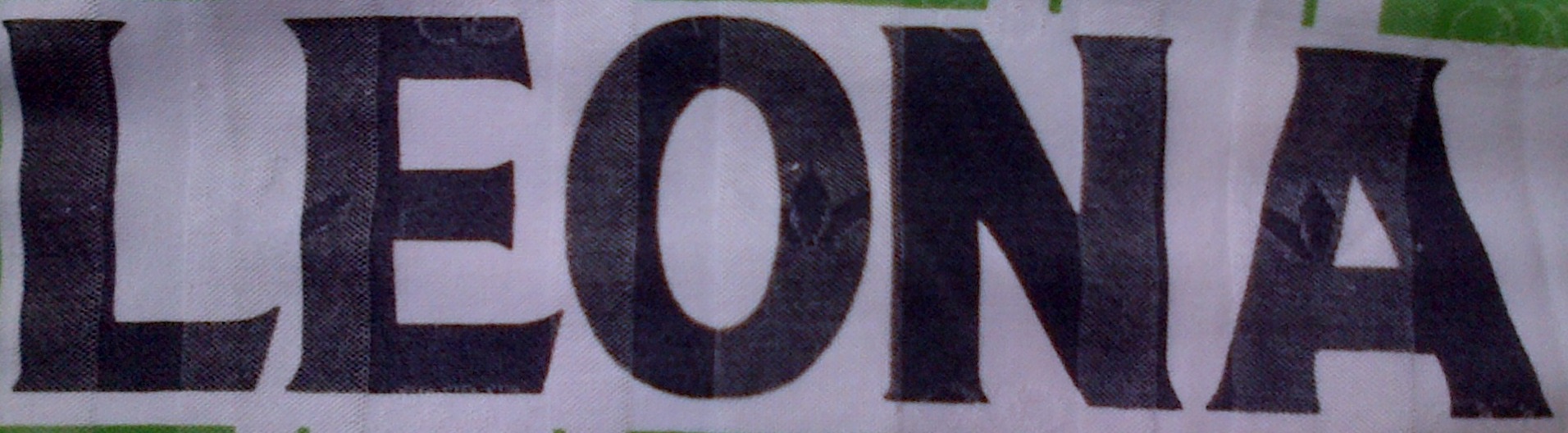
Carefully check the amplitude of the letter 'O', the termination of the letter 'R' and the shape of the letter 'E'






| Attachment | Size |
|---|---|
| 1.jpg | 11.59 KB |
Carefully check the amplitude of the letter 'O', the termination of the letter 'R' and the shape of the letter 'E'
| Attachment | Size |
|---|---|
| 1.jpg | 11.59 KB |
I'm almost certain this is custom drawn, but these come close:
http://www.myfonts.com/fonts/gatf/chipping/regular/ (more for LEONA, not so much for CERVEZA)
http://www.myfonts.com/fonts/shinn/beaufort/
http://www.fonts.com/font/berthold/laudatio-bq/volume (medium weight)

Perhaps the closest out of the box tiny/spur serif fonts to this lettering are:
Mythica http://www.myfonts.com/fonts/k-type/mythica/ Even has a similar convex curve to the leg on the _R_ Has several weights to handle the different versions sof the lettering.
Modesto http://www.myfonts.com/fonts/parkinson/modesto/ Note the close _E_. Several widths and weights.
Don
Captured from web.archive.org on 10 Sep 2014. view this capture
