
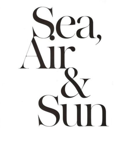
Anyone recognize this beauty. I can't make a match to the thin serifs, particularly with the "e".
Thanks for any insight you may have.
JC
Font:
Jocham, Hubert/DoubleUSerif Medium
Solved By:
Anyone recognize this beauty. I can't make a match to the thin serifs, particularly with the "e".
Thanks for any insight you may have.
JC

It's a version of Didot, but I'll have to search out which one. Freight Display has an ampersand that bows like this one, but the whole font isn't delicate enough to match the sample.

Jocham, Hubert/DoubleUSerif Medium
http://www.hubertjocham.de/custom/

Kthomps5 and Dpape. Thank you both for the reply!
Yes the Hubert Jocham Double U Serif looks to be a match.
Although the "e" doesn't seem to slant up and the dot of the "i" looks higher up. Those details may be custom to the headline. I'm calling it mystery solved.
Many thanks again. I love the Typophile folks.
JC
Captured from web.archive.org on 17 Mar 2015. view this capture