
This is my new typeface Turbine. It will be part of the fontfont family soon but I think it is still a lot of work to do. The idea is quite simple: A squarish grotesk with open apertures. I would be very happy to get some comments and suggestions.
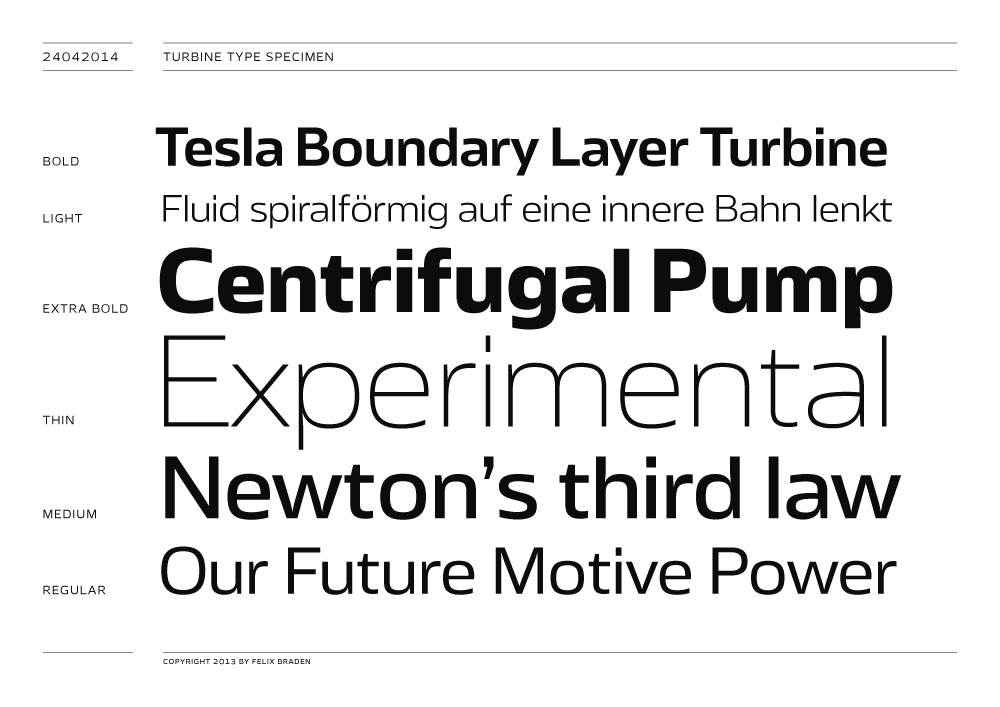
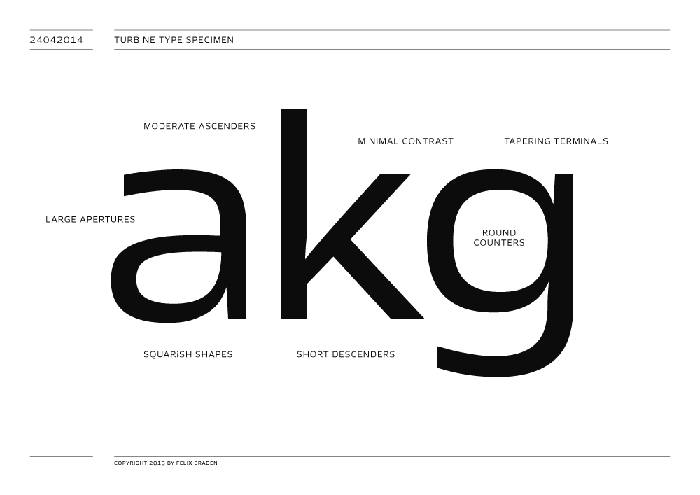
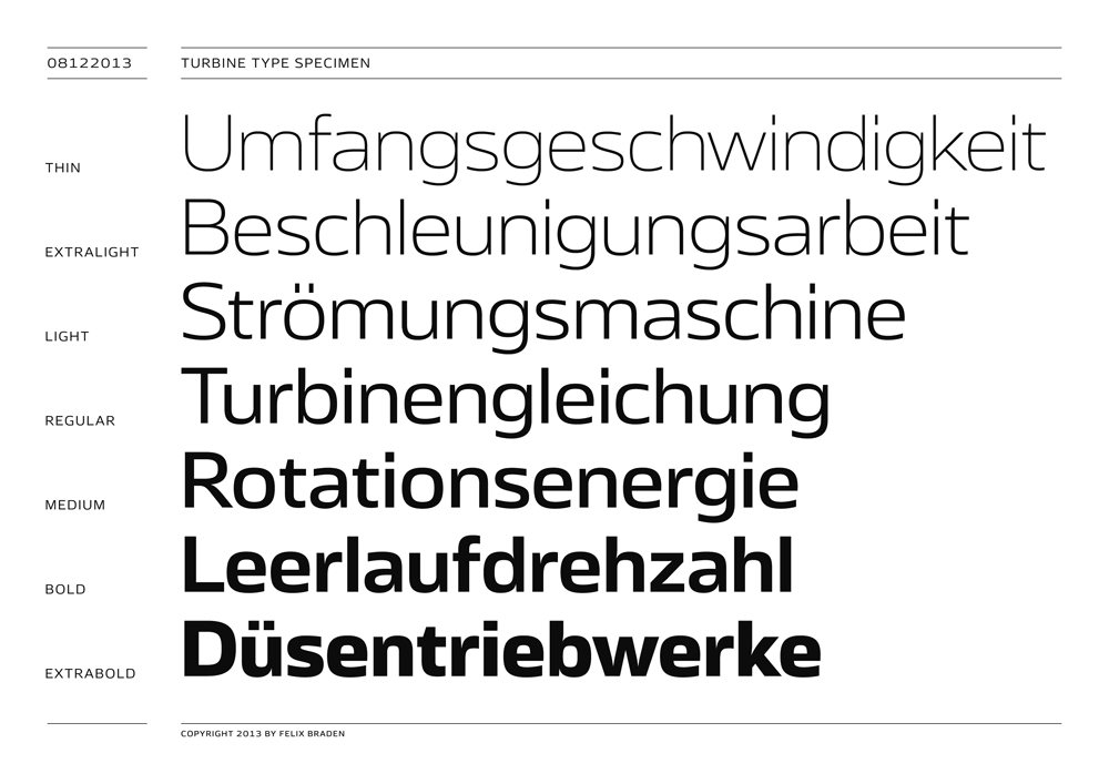
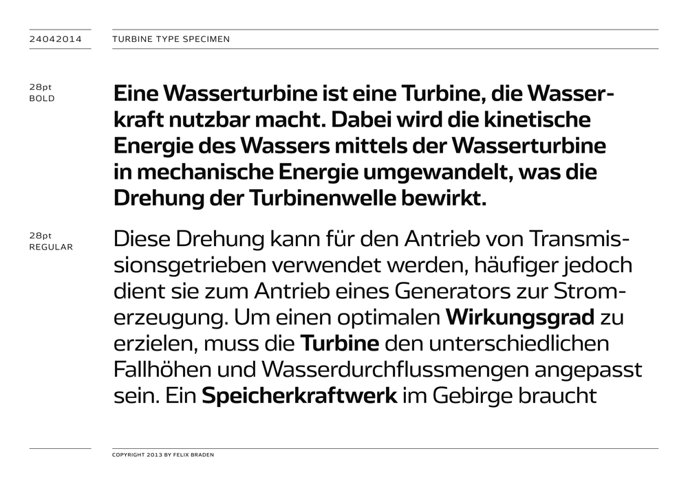
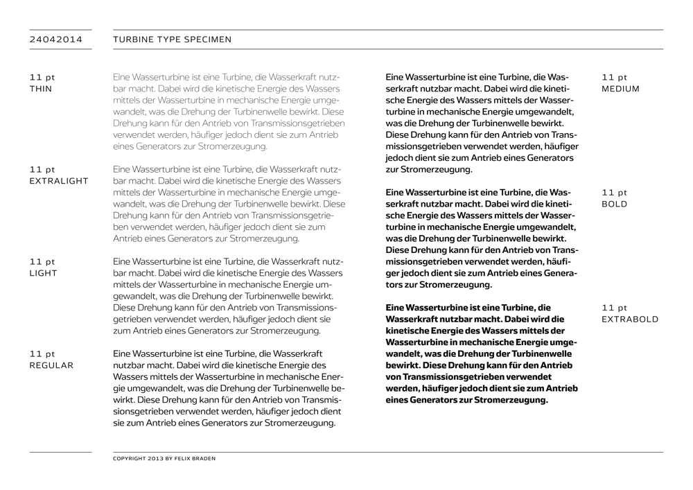
This is my new typeface Turbine. It will be part of the fontfont family soon but I think it is still a lot of work to do. The idea is quite simple: A squarish grotesk with open apertures. I would be very happy to get some comments and suggestions.

I think /f and /t could be a little bit wider to get the same openness as in the other letters. I think I would make the spine of /s a bit less diagonal. That's all the feedback I can give. I like the typeface a lot.
Thanks for the hint with the spine of the /s. I fixed the problem and I think it works much better.
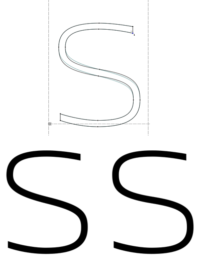

That's better even though I would lightly reduce the thickness of the spin. However it's hard to compare without other letter.

Wait, which "s" is better, and why?
(What André said.)
hhp
Thank you, Erik van Blokland, for that helpful suggestions and hints
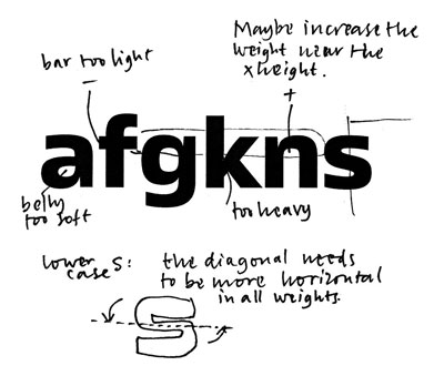
Shame to not do it here.
hhp
Captured from commoncrawl.org on 27 Apr 2015. original URL
I think the second /s is clearly better as it follows the squared shape of the other letters more clearly. I also think it's more aesthetic on its own, though that's probably a secondary consideration.