
I have an antique custom-lettered / engraved book cover that I'm trying to trace and use the general style of the type to create a logo for a band.
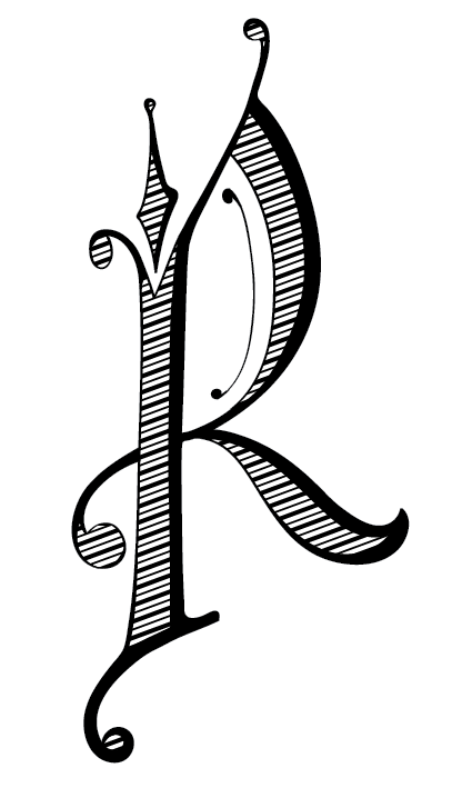
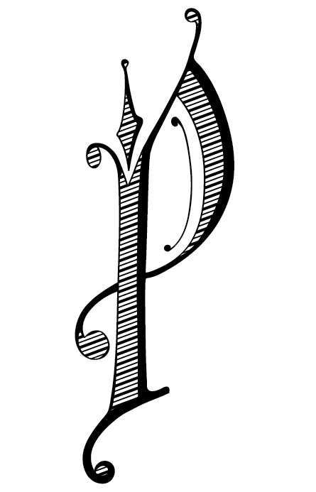
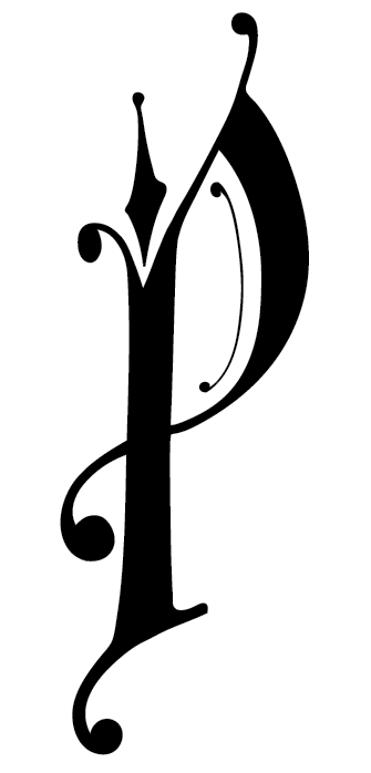
Right now I'm trying to turn a capital P into an R. I'm not sure if this is the kind of leg I should use or not, but so far it's the only one that has looked ok. Hoping for some advice / critique on this. Thanks so much!
R:

P (original):
| Attachment | Size |
|---|---|
| pennsylvania-illustrated-R1.gif | 16.82 KB |
| pennsylvania-illustrated-R2.gif | 8.76 KB |
| pennsylvania-illustrated-P2.gif | 7.53 KB |


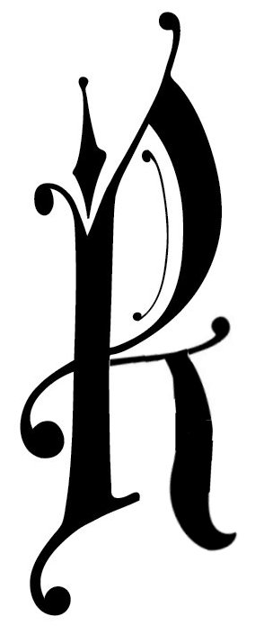
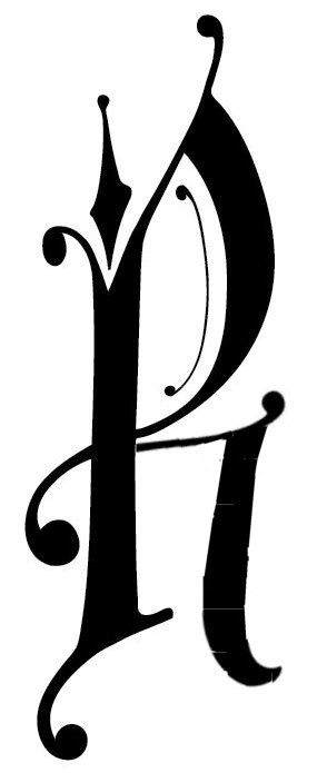

I agree that it looks great, but it is too wide. The original is a condensed design and the new leg extends outward too much. Otherwise, good job!