
Is this one or 2 fonts? especially looking at the question mark in the first sentence
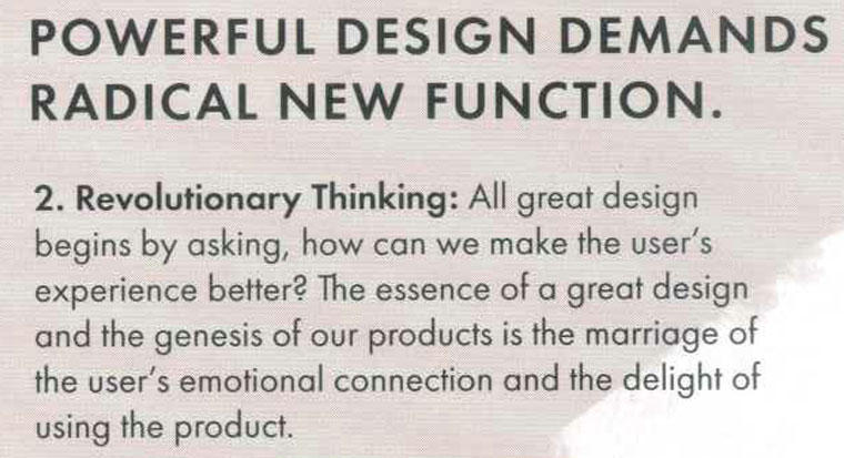
Is this one or 2 fonts? especially looking at the question mark in the first sentence
Paul Renner's Futura
I know it looks close but the M is too pointy at the top. I don't think its Futura.
I know it looks close but the M is too pointy at the top. I don't think its Futura.
Have a look to the heavier weights of Futura and you'll see /M is not pointy.
Captured from web.archive.org on 25 Jul 2014. view this capture