
Back again, could anybody identify this particular Blackletter typeface or a close equivalent?
Thanks for your help
| Attachment | Size |
|---|---|
| Blackletter.jpg | 146.42 KB |
Back again, could anybody identify this particular Blackletter typeface or a close equivalent?
Thanks for your help
| Attachment | Size |
|---|---|
| Blackletter.jpg | 146.42 KB |

A very standard Fraktur but I have not spotted an exact digital match.
Walbaum Fraktur is close but the digital does not include the lighter weight
http://www.myfonts.com/search/walbaum+fraktur/fonts/
Neue Luthersche Fraktur http://www.myfonts.com/search/Neue+Luthersche+Fraktur/fonts/ has both a light and heavier weight.
Fette Fraktur http://www.myfonts.com/search/fette+fraktur/fonts/ is very close to the letterforms, but looks too heavy. No light version.
Very few Frakturs have been digitized.
Don

Many Fraktur fonts are rather close.
I was just about to post the same recommendation of Neue Luthersche Fraktur because of the two weights. You might also check out Paul Lloyd's Proclamate (hit the Black Jewels link, then use the dropdown menu) for the same reason - plus four decorative variants as a bonus.
Walbaum Fraktur and Fette Fraktur are both fair matches for the bold sample, but Walbaum Fraktur is too light and Fette fraktur is too heavy. Here is an interesting experiment in which the two are blended 50-50
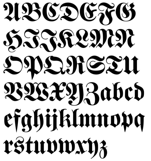
The best match I've found by far for the lighter heading is Neue Fraktur in Typoasis' Blackletter Revival. It even contains very similar didone-style numerals. The download contains two files, Neue Fraktur & Neue Fraktur Extra Bold. The latter is too heavy, but perhaps manually bolding the regular weight would work.
This collection was lovingly digitized by Manfred Klein and cybapee (Petra Heidorn) almost a decade ago and offered via Petra's Typoasis website. The internal copyright of these fonts state, "Johannes Wagner, Hausschnitt" with the Extra Bold adding a date of 1927.
You won't find cybapee or Manfred's names in the copyright of most of this collection. Having been in contact with Petra Heidorn several times back then, I know that she valued privacy rather than accolades, offered all her fonts for free and both of them wanted to credit the original designers. Unfortunately, that has a negative consequence since, years later, you only have the word of a guy like me to assure you that the font is legitimate and not a clone of someone else's font. In fact, back when these were made, several were the very first digitizations of some of these blackletters.
Thanks Mike. This would work for as a substitute for the lighter Fraktur. I appreciate your comments on the fontmaking ethos of that era compared to today. The idea of making a font for the sheer love of doing it and then giving it away seems to have faded away.
Don
Thank you very much for your help and insights, I really appreciate it. The embarrassing thing is that I think I already have that Neue Fraktur somewhere
Glad to help, Kieran.
Captured from web.archive.org on 25 Jul 2014. view this capture
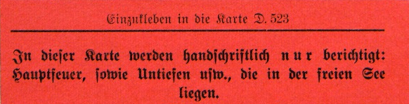
You're welcome Kieran. As for the use of the right Fraktur, for better or worse most people today can not read Fraktur capitals with any ease and they tell the swirly ones apart mainly from context. The exception may be mathematicians who use very standardized versions of the capitals as math symbols. But for other readers the mix and match choices offered by Mike and myself should work fine.
Don