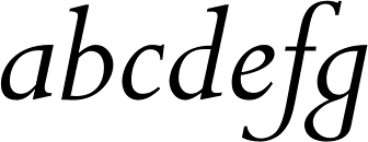
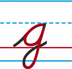
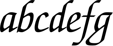
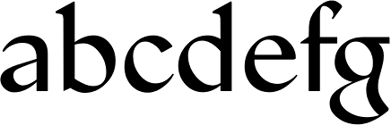
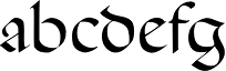
Two designers quoted the Middle Age era in the lower case "g":
1. Jan Van Krimpen with the italics of Lutetia, Romanée, Haarlemmer, Spectrum
2. Eric Gill with the italics of Perpetua, Golden Cockerel, Joanna, Aries
.
¶ Do you know who's started this italic "g" trend?
.
PS: I've noticed the medieval "g" in the italics of ITC Galliard and ITC Esprit.